Browsing the archives for the elections tag.

Charts! Last weekend’s elections in Saxony: Dresden, Leipzig and Chemnitz vs. the rest of the state

European Politics, International Politics, Politics

Last Sunday’s state elections in Saxony were marked by a low turnout, an only slightly eroded dominant position of the Christian-Democrats, and an imposing result for the right-wing, anti-system Alliance for Germany (AfD) party. The AfD was helped by the fact that these elections, the first state elections it ever took part in, took place in the very state where the party had already done best in the federal and European elections. Nevertheless, its 9.7% of the vote was remarkable and well beyond what the polls had foreseen.

Election night had its share of suspense as the extreme-right NPD hovered right around the 5% electoral threshold. It ended up missing it by a hair and getting 4.95%, which means it’ll be cast out of state parliament after ten years in its stronghold state.

There are several interesting geographic dimensions to the results, and I created an infographic at Infogr.am to share them. Below the fold, I accompany the Infogr.am charts with a few observations about what they show.

Continue Reading »

Comments Off on Charts! Last weekend’s elections in Saxony: Dresden, Leipzig and Chemnitz vs. the rest of the state

Of sideshows, curiosities and structural changes: Everything you ever wanted to know about this year’s local elections in the Netherlands (and probably quite a bit more)

European Politics, International Politics, Politics

Update: see also this post about the provincial elections of 2015 in the Netherlands – it has better maps and dives into some electoral history as well.

It’s not easy for local elections in a country the size of The Netherlands to make the international news. But if there’s anyone who can make it happen, it’s the peroxide-blonde leader of the Dutch far right Freedom Party, Geert Wilders. And that’s what he did, on March 19, when the municipal election results were being tallied.

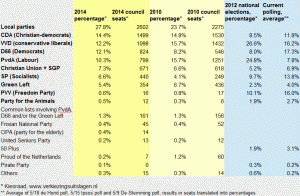
2014 Municipal election results, the Netherlands

Click to enlarge: 2014 municipal election results

Orating to a Freedom Party rally in The Hague, Wilders asked his supporters to give “a clear answer” to three questions that he was going to ask them; three questions that “defined our party”. “Do you want more or less European Union?”, he started off. Less, less, his supporters chanted enthusiastically. Second question: “Do you want more or less Labour Party?” Again, the crowd clapped and chanted: “less, less!”. So Wilders moved on to the third question. “I’m really not allowed to say this,” he started, but “freedom of expression is a great value … so I ask you, do you want more or fewer Moroccans, in this city and in the Netherlands?” The crowd, elated, chanted back: “Fewer, fewer, fewer!”, and with a sly little smile Wilders remarked, “then we’ll go and arrange that”.

Which got the Dutch election night headline space from the BBC to The Guardian, from the Times of Israel to Al-Jazeera, and from Fox News to the Huffington Post.

All of which was pretty unfair, considering that Wilders’ Freedom Party (or the PVV, as the Dutch call it) had been something of a non-entity in the whole local elections campaign. The party had refrained from taking part in the elections altogether in all but two municipalities: The Hague, the seat of the Dutch government, and Almere, a large town in Amsterdam’s commuter belt. Moreover, as was mentioned in almost none of these stories, it actually lost votes in both cities.

Continue Reading »

4 Comments

If Facebook ‘likes’ were votes, the far-right Jobbik would be the largest Hungarian party

European Politics, International Politics, Politics

Which Hungarian political parties use Facebook most successfully to create and engage with a significant online following? A comprehensive effort to find out reveals two things: the balance of forces between the Hungarian parties on Facebook is very different from what the actual results of the elections in April will be like – and despite what is basically a three-party system in real terms, there are a lot of Hungarian political parties with a Facebook presence.
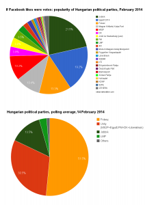
Facebook likes vs current polling for Hungarian parties

Facebook likes vs current polling for Hungarian parties

The chart on the right (click to enlarge etc., and yes, it’s a pie chart – but if that makes you twitch, there’s a bar chart further down this post) specifies the 22 parties with the largest numbers of fans. For comparison’s sake there’s a chart representing current opinion polling data underneath.

I’ve taken the concept of  “parties” in a light spirit and included the satirical Two-Tailed Dog Party (which once again has been denied registration, so it can’t take part in the elections this year), and it happens to blow many of the regular parties out of the water. (On that note, the Fourth Republic party 4K! probably also enjoys an unfair advantage, since it might now be seriously campaigning as an alternative left-wing party, but it used to be better known on Facebook for organizing things like an annual pillow-fight event.)

So who wins the Facebook races?

That would be the populist, far-right Jobbik party, best known for its rhetorics against “Gypsy crime” and recurrent bouts of anti-semitism. It is ‘liked’ by a whopping 188 thousand people on Facebook. Jobbik is especially strong among young voters, so its prominent showing on Facebook is no surprise, though the fact that it beats out all the other parties may be more of a shock. In the 2010 elections, Jobbik received 17% of the vote, and right now it’s polling at about 13%, so it’s a significant force in the real elections as well, but will remain deep in the shadows of the governing Fidesz-KDNP alliance in the elections.

Right behind Jobbik is Together 2014, the movement launched around former Prime Minister Gordon Bajnai, which for some time from late 2012 on roused the hopes of a center-left, liberal, pro-EU electorate for a strong new opposition force. The movement largely fizzled out though, and is now taking part as the largest junior partner in the five-party, left-of-center “Unity” opposition alliance under the leadership of the Socialist Party’s Attila Mesterházy. Together 2014 does almost as well as Jobbik on Facebook, which surprised me – but only in quantity of likes, not in actual engagement, as I’ll show below.

Third place is for Fidesz. All-powerful as it may be in the Hungarian state, government and, dare one say, economy (as well as current election polling), it doesn’t even get to play second fiddle on Facebook. Or does it? Fidesz may have ‘only’ 116 thousand or so likes, Prime Minister Viktor Orban has 219 thousand. Bajnai, in comparison, only has 103 thousand, and Jobbik’s Gábor Vona 155 thousand.

Coming in fourth is … no, still not the Socialist Party. It’s the Two-Tailed Dog Party, which promised such goodies as free beer, eternal life and “more of everything, less of nothing” in its previous abortive attempt at joining electoral politics. The Socialists only have 89 thousand likes – an unsurprisingly weak performance for a party best known for its legacy support among stubborn pensioners. Though Mesterházy himself does significantly better, with 152 thousand likes.
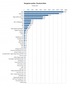
Chart: All Hungarian parties with more than 250 likes on Facebook

All Hungarian parties with more than 250 likes on Facebook

The rest of the parties follow at a respectful distance. The most popular of the lot include former Prime Minister Ferenc Gyurcsány’s Democratic Coalition, with 34 thousand likes (though his own page does much better, clocking in at almost 89 thousand) and the green party Politics Can Be Different (LMP), with 24 thousand.

The latter is outdone by two others though. The LMP broke up acrimoniously last year, and the break-away fraction formed “Dialogue for Hungary” (PM), which swiftly joined Together 2014 and, now, Unity. And on Facebook, PM easily surpasses LMP with 31 thousand likes. Even more surprisingly, both have fewer Facebook likes than the Welfare and Freedom Democratic Community (JESZ), which was founded upon the ashes of the once-important Hungarian Democratic Forum.

Honourable mentions go, not just to Fourth Republic, but also Lajos Bokros’s Modern Hungary Movement (16 thousand likes) and … the Independent Smallholders Party. They still exist! “Újra erősek vagyunk!”, We Are Strong Again, their posters exclaim somewhat optimistically, and hey – they do have more likes than any of the three liberal parties that emerged from the wreckage of the Alliance of Free Democrats. (Which reminds me: does Hungary really need six different green parties?)

The largest party, on Facebook at least, that I had never heard of is the Elégedetlenek Pártja, i.e. the Party of the Discontented. Which seems fitting. And if you think that the parties at the bottom of this second chart, which are mostly of the far-right, far-left, ecological and Romani varieties, are doing rather pathetically with just a couple of hundred likes, trust me – it can be much worse. After doing Facebook searches for every party I came across trawling through the Hungarian Wikipedia’s list of parties, the list of parties that registered a willingness to take part in the last elections and, last but not least, the decisions handed down by the National Elections Commission so far this year, I’ve found a total of 60, and the smallest one has just 13 likes. There are actually 15 different parties with fewer than 100 likes – don’t these people have friends and families to rope in? Here’s the full list – with URLs.

UPDATE: Active followers vs. disengagement and ‘fake’ likes

There are of course a lot of ways to artificially boost the numbers of likes for your page. Paying Facebook for ads is the simplest way. If you want to break the rules, you can also pay clickfarms for thousands of extra likes, though many of them might then come from South- or East-Asia. A friend pointed me to some evidence that a couple of Jobbik politicians took a more convoluted road. At least that’s what a blogger appeared to find out, when he followed a link to some clickbait story on a Hungarian site called DailyStory, was asked to ‘like’ the site to see the content, clicked ‘like’, and afterwards went back to his Facebook profile to erase the ‘like’ again. Turned out he hadn’t just liked anything from DailyStory, but instead the Facebook page of a Jobbik MP. A look at the page source of the DailyStory item confirmed that they’d actually pointed the ‘like’ to Mr. Lajos Kepli’s page, and some further digging revealed that the owners of DailyStory also own a site called “LikeMarket”. Looks like Mr. Kepli, and at least one other Jobbik politician, used that site’s services …

Does that mean that none of the numbers in this blog post can be trusted? Or that the Jobbik page’s numbers are probably bogus? I don’t think so, and not just because the revelations were only about a couple of individual politicians.

Of course it’s always good to be skeptical about page likes as stand-alone metric.  If you want to review an entity’s success in engaging supporters on Facebook more properly, you should look beyond those, for example at how many likes, shares and comments individual posts get, or how many people click on the links on the page. Since people who were tricked in liking a page or got paid for it by a clickfarm aren’t likely to start actively commenting on it, that also helps to weed out the fake “likes”. Of course all of that goes far beyond the scope of a blog post, but Facebook does provide a straightforward alternative metric: “Talking about this”.
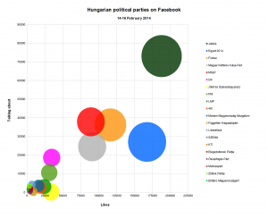
Likes versus 'Talking about it': engagement of Facebook followers

Likes versus 'Talking about it': how engaged are the FB followers of the different parties?

This metric measures how many people have, in the past week, commented on, shared or liked a post, joined an event, mentioned or checked in at a page, etc. Since it still includes new page likes too, it doesn’t wholly do away with the problem, but it helps. So how do the Hungarian political parties do when comparing total page likes and “people talking about this”? The chart’s on the right!

Turns out, Jobbik still rules the roost. Both in page likes and people ‘talking’ about their page. Their conversion rate of likes into actual engagement is actually better than most of the other parties are doing – suggesting no evidence of massive numbers of ‘fake’ likes distorting their top line number.

Instead, it’s Together 2014 which has a very low conversion rate, which is why it’s drooping towards the bottom right of the chart. Evidence that Together 2014 has fake likes? Not hardly, because many other things can explain such disengagement on the part of the ‘likers’ too. A feeling of resignation, for example, or disappointment. Together 2014 roused a fair bit of hope among center-left and liberal opposition supporters when it was launched – but a lot of those people are presumably not particularly enthusiastic by the new “Unity” alliance which Together 2014 has joined, led as it is by the Socialist Party and burdened by its inclusion of the very divisive politician Ferenc Gyurcsany and his Democratic Coalition.

Wholly anecdotically, I can say that 17 of my friends turn out to ‘like’ the Together 2014 page, more than any other party except the Two-Tailed Dog Party (which I guess tells you something about my friends) – and I know that many of them don’t trust Gyurcsany and/or the Socialists (who have a solid base but are perceived as corrupt, inept ex-communists even by many liberals and greens). There really doesn’t seem to be any enthusiasm about these elections – it’s all resignation about the inevitability of a Fidesz victory and the unattractiveness of the opposition.

It’s therefore interesting to see which other parties are showing higher or lower engagement rates among their Facebook followers. Higher than most? The Democratic Coalition and, to a lesser extent (roughly at a par with Jobbik), the Socialist Party. A sign that the old-fashioned polarization of the election campaign is rallying the base of the traditional left, at the same time (and for the same reasons) as it is depressing engagement among those who feel alienated from the old politics? Just like Together 2014, the green Politics Can Be Different party is doing weakly as well, burdened by last year’s split and its gloomy prospects of making it back into parliament.

Among the small parties, followers of Fodor’s Liberálisok do seem very engaged, and to some extent those of the KTI are too. Those of 4K!, many of whom probably came for pillow fights rather than politics, are not. The center-right JESZ, belying its relatively high number of page likes, is getting hardly any interaction at all – over 33 thousand likes, but just 205 people ‘talking about it’, that’s a horrible engagement rate. Then again I don’t think they’re taking part in the elections. Among the tiny parties, two itty-bitty green parties, the Zöldek Pártja and Élőlánc Magyarországért, have proportionally high ‘Talking About This’ numbers.

Age appeal

Finally, one thing is true for most of the political parties: people who ‘like’ a party are old, especially in the context of Facebook. As in: between 55 and 65 years of age. The notable exceptions are Jobbik, LMP, 4K! and, surprisingly, the KTI and Jesz. (Really? In combination with the horrible engagement rate, you’d almost think it’s JESZ which bought some likes …). Here are the numbers, according to Facebook, right now:

.

Party

Most pop. age group

.

Jobbik

18-24

.

Together 2014

55-64

.

Fidesz

35-44 / 55-64

.

Two-Tailed Dog Party

18-24

.

Socialist Party

55-64

.

Democratic Coalition

55-64

.

JESZ

18-24

.

PM

55-64

.

LMP

25-34

.

4K!

18-24

.

Modern Hungary Movement

55-64

.

Independent Smallholders

35-44 / 55-64

.

Liberals

55-64

.

SZEMA

55-64

.

KTI

18-24
Comments Off on If Facebook ‘likes’ were votes, the far-right Jobbik would be the largest Hungarian party

The geographical (and historical?) divisions underlying Ukraine’s political strife

European Politics, History, International Politics, Politics

As Washington Post blogger Max Fischer illustrated with what he called “the one map you need to understand Ukraine’s crisis”, the current protests and revolts in Ukraine are fierce, but largely limited to the north and west of the country, which is right in line with the pattern revealed in the 2010 election outcomes. It’s no secret that the same broad geographic divide appeared, time and again, in most of the elections since 1991, when Ukraine gained independence.

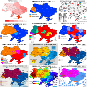
Ukrainian election maps, 1991-2012

Ukraine: Election maps for all the main elections since 1991

For convenience’s sake, I gathered electoral maps for all the presidential and parliamentary elections in those twenty years (as well as the 1991 independence referendum), in one big overview file. All of those maps are from Wikimedia/Wikipedia.

(One contestable editorial decision I made for the 2012 parliamentary elections was in choosing the map that showed the leaders in multi-member districts by constituency, rather than the one showing the leaders in single-mandate constituencies, which includes a lot of independents and is therefore less clear. I also couldn’t find a map of the results for Gorbachev’s All-Union referendum in 1991.)

Oddly, the candidates actually running for presidential office sometimes seemed irrelevant to the geographic divide itself. In 1991, the former dissident Viacheslav Chornovil was the worthy but politically weak candidate who won only in the Galician northwest of the country, while former apparatchik Leonid Kravchuk based his landslide victory on wide support in the south and east. But in 1995, the roles were reversed: Kravchuk won constituencies across the north and west when he lost his reelection bid against Leonid Kuchma, who swept the vote in the south and east. Those elections marked the first real time that the electoral map showed a dividing line right down the middle of the country that would start marking election maps again in every major election after 2002. But it gets stranger still: move on to 1999, when Kuchma faced a Communist Party candidate as opponent in his reelection bid — and it was Kuchma who won almost all of the north and west, while support for the communist candidate was based mostly in the south and east.

Considering Chornovil’s, Kravchuk’s and Tymoshenko’s losses, and the gritted teeth with which many voters in Kiev and the northeast must have voted for Kravchuk in ’94 and Kuchma in ’99, it’s hard to elide the thought that this pattern illustrates how the real political power in the country has lain in the south/east. The voters in the north/west have had to choose between voting for the lesser evil or rebelling in the streets. Yushchenko’s victory would be the only exception, and that took a revolution. I doubt that Viktor Yanukovich will ever switch to being the northwest’s candidate, though …

There is one further geographic wrinkle of note in these maps, and that is how the Transcarpathian/Ruthenian region constitutes a bit of an outlier within the northwestern half of the country. That’s the region midway on the left side, where the country’s borders take a turn east to curve around Romania, which is often coloured differently from all the surrounding territories. It can’t be a coincidence that the historical background of that region is wholly separate. Whereas the rest of northwestern Ukraine used to belong to the Polish-Lithuanian Commonwealth, and much of it to interbellum Poland as well, this region belonged to the Austro-Hungarian empire until WW1, and to Czechoslovakia between the two world wars.

When it comes to elections, history can be destiny. A map overlaying the borders between Imperial Russia and Imperial Germany on the Polish election results of 2007 has done the rounds online among map geeks for a few years because of the striking correspondence it reveals. And on a Reddit thread about these Ukrainian election maps, commenter Martin Keegan pointed out that “the boundary is where the old Polish-Lithuanian – Russian border used to be,” an idea he previously proposed on his blog. That piqued my curiosity, so I ventured on an effort to do a similar overlay to the Polish one: how do the old Polish and Lithuanian borders with Russia overlap with Ukraine’s current political polarization?

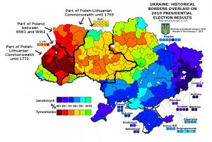
It was more of an effort than I’d have thought. But here is the result, overlaying different historical borders on the 2010 Presidential election results. It turns out that Keegan wasn’t entirely correct about the old Polish-Lithuanian – Russian border – but he definitely had a good point about the continuing salience of historical borders. Check out how the territory that still belonged to Poland in between the two world wars overlaps with the most overwhelming support for Tymoshenko (click the map to enlarge).


Historical borders and the 2010 Ukrainian election map

History as destiny? Historical borders superimposed on the 2010 Ukrainian election map

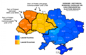
Moreover, Keegan’s point appears more vindicated when looking at the 1991 referendum results, though the division there was merely one between a large versus a near-unanimous majority in favour of idependence, or, especially, the 1994 presidential elections. Here is what the historical overlay looks like for the latter:


Historical borders and the 1994 Ukrainian election map

History as destiny, Pt. II? Historical borders superimposed on the 1994 Ukrainian election map


There are, however, also ways in which history is conspicuously not destiny. Or at least not in ways that are immediately obvious or make sense intuitively. Check out this map of the Holodomor – the genocidal, man-made famine that struck large parts of Ukraine, which is often blamed on indifference or outright malice on the part of Stalin and his regime. Compare it with the post-independence electoral maps, and any overlap is … hard to see. If anything, the Holodomor was most devastating in areas that now habitually side with Russia-friendly politicians like Yanukovich. Which doesn’t immediately make instinctive sense.

Methodological note:

The historical borders are approximate, though I did my best to be precise. As source material I used a map of Northeastern Europe around 1700; a Wikimedia map of the Polish-Lithuanian Commonwealth anno 1789; a Wikimedia map of Poland after the Second Partition of 1793; the detailed 1794 Laurie and Whittle map of the Kingdom of Poland; and an administrative map of Interbellum Poland in 1930. In addition, I used the Wikipedia page and subpages on the administrative raions of Ukraine,  and a detailed Ukrainian Wikimedia map of the electoral multimandate raions of the country. Delineating the far eastern border of the Polish-Lithuanian Commonwealth was a bit difficult since some settlements like the erstwhile Krylov that were right on the border back then have long been submerged in the Kremenchuk dam reservoir. In the south, the problem in defining how the historical border overlaps with current territories, lacking more detailed maps, lies with the transfer of Transnistria to Moldova.

3 Comments

Failure or success for the regime? The constitutional referendum results in comparison and the political geography of Egypt

International Politics, Politics
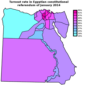
Map: Egypt 2014 constitutional referendum - Turnout by governorate

Egypt 2014 constitutional referendum - Turnout by governorate

Last Sunday, Egypt’s Supreme Electoral Committee announced the results of the referendum on the new constitution: no less than 98.1% of Egyptian voters had cast a vote in favour of the new text. That Eastern Block-style result should, however, be placed in the context of a turnout of just 38.6% — surely a less resounding affirmation of the new regime than the army would have hoped. Turnout reached up to 51-53% in the governorates of Menofiya and Gharbiya, in the Nile Delta, and Port Said; but it stayed under 24% in the governorates of Matrouh, Fayoum, and upriver in Sohag and Qena.

How does this result compare with the turnout and “Yes” vote in 2012, when it was the Muslim Brotherhood government that was pushing through a constitutional referendum? In addition, what does the turnout map reveal about the political geography of Egypt? The current referendum was of course boycotted by the Muslim Brotherhood, as well as by the most radical of the revolutionary groups, the April 6 Movement. The April 6 Movement is relatively small, however, and the constitution was supported by many other liberal and radical groups (and the extent of popular support for the liberal and leftist groups is in any case in doubt). So were the areas of low turnout correlated to areas of high support for the Muslim Brotherhood?

The trick in comparing the results of this year’s referendum with the one two years ago is that you’re dealing with two separate elements: the turnout, affected as it might be by boycotts and apathy, and the percentage of actual “Yes” voters. This year, turnout was low, at least by international standards, but almost everyone who went out to vote, voted “Yes”. (Considering the current climate of repression, opponents might also not have dared to come out to vote “No”). However, in the 2012 referendum turnout was even lower, at 32.9%, and in addition, there was a substantive number of people who came out only to vote against the Muslim Brotherhood’s constitution.

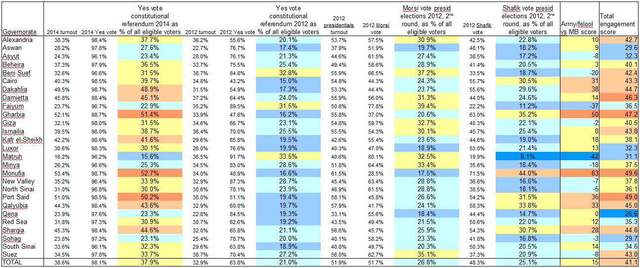
To take account of both elements, in the table below (click for full size), I’ve taken the turnout and “Yes” vote percentages in each referendum and calculated the number of “Yes” voters as percent of all eligible voters. I also did the same for the results of the second round of the 2012 presidential election, when Brotherhood candidate Mohamed Morsi faced off against Ahmed Shafik, widely associated with the ancien regime, army and “felool”.

Table: Egypt constitutional "Yes" votes of 2012 and 2014 in comparison

The constitutional "Yes" votes of 2012 and 2014 and the 2012 presidential election results (second round) in comparison, taking into account turnout rates

In short, especially when you take turnout into account, the army’s referendum this year fared much better than the Brotherhood’s proposal two years ago. Then again, context is important. The army inundated the airwaves and streets with propaganda, whereas even just carrying flyers against the constitution could get you harassed or arrested. Morsi’s government was repressive in its own ways, but the campaign back then wasn’t anywhere as one-sided, with the opposition holding public rallies in Tahrir Square and elsewhere. The direct comparison in this table shouldn’t therefore be taken simply at face value. One thing it can be useful for, I think, is to identify local and regional electoral patterns.

In the table above, I added two extra columns at the right end, based on formulae that I freely made up on the spot. I rather crudely labelled the first one the “Army/felool vs MB score”, which I know overly simplifies things. The formula is very straightforward:

Yes vote 2014 as percent of eligible voters + Shafik vote as percent of eligible voters - Yes vote 2012 as percent of eligible voters - Morsi vote as percent of eligible voters.

Egypt: "regime vs MB" score by governorate [Map]

"Regime vs MB" score: The Yes vote in the 2014 constitutional referendum and the Shafik vote in the 2010 presidential elections, minus the Yes vote in the 2012 constitutional referendum and the Morsi vote in the 2010 presidential elections (all as percent of all eligible voters)

By this calculation, the Faiyum and Matruh governorates are the only real Muslim Brotherhood strongholds, where Morsi and the 2012 referendum fared much better than nationally, and Shafik and the 2014 referendum fared much worse. Beni Suef and Minya follow at some distance. Those are also the only four governorates where a higher percentage of all eligible voters turned out to vote “Yes” in the 2012 constitutional referendum than in the 2014 one, though the difference in Beni Suef and Minya was small. (It might be worth noting, though, that Morsi didn’t win Matruh in the firstround of the 2012 presidential elections; it went for Abdel Moneim Aboul Fotouh, a former Brotherhood leader who built his campaign on a hybrid coalition of moderates and Salafis).

On the other hand, by this calculation, Monufia and Gharbia are by far the strongest army/establishment bulwarks, but Dakahlia, Port Said, Qalyubia, Cairo and Sharqia all rank highly here too.

There is another, less obvious dimension of these results though, which interested me when I noticed that the people of Aswan, Qena, Sohag and Luxor appear to not have particularly liked any of the choices. In these governorates, both the “Yes” vote in 2012 and that of 2014 (as percentage of all eligible voters) stayed below the national average. And turnout in the second round of the presidential elections there was low enough that both Morsi and Shafik failed to reach their national average score, as percentage of all eligible voters. That’s why I added that last column in the above table. I dubbed it the “engagement score”, but it’s really nothing more than just the average turnout in the three elections.

Egypt: "Engagement score" [Map]

Average turnout in the second round of the 2012 presidential elections, the 2012 constitutional referendum, and the 2014 constitutional referendum

Interesting to me is that Cairo and Alexandria actually rank somewhat highly on this score. All of the options on these ballots (the two draft constitutions and the candidates in the second round of the presidential elections) were disliked by some or all of the liberal and left-wing groups — which you’d expect to be be overrepresented in the two main cities. But if their supporters took part in the boycotts, it didn’t have a marked additional effect: turnout in the two cities was actually around or a little above average at each of these three times. Which is a lot more than can be said about the upstream and some of the out-country governorates. So this might further underscore the relative impotence of these groups. The call from some radical groups, like the Road of the Revolution Front, to take part in the 2014 referendum but vote “No” also obviously achieved little.

The correlation between the two above maps also suggests a strategic problem for the Muslim Brotherhood (though it is obviously more concerned with more immediate threats at the moment). Most of the governorates where the army/regime appeals least, judging on the 2014 results and Shafik’s 2012 result, also seem to be among the lesser-energized governorates overall, which weren’t particularly motivated to turn out by either of the two sides in these elections/referenda.

After all, Faiyum, Matruh and Minya didn’t just massively boycott the 2014 referendum; in 2012 turnout there was barely over the national average, and in the 2012 presidentials Morsi can’t have inspired them too much either, because turnout was either just around the national average or, in the case of Matruh, much below it. (Beni Suef is the exception, with an above-average ‘engagement score’).

Comments Off on Failure or success for the regime? The constitutional referendum results in comparison and the political geography of Egypt

Money raised versus result achieved: The Senate ’08 sweepstakes

Congressional Elections, Politics, US Elections, US Politics
Excel sheet: US Senate candidates 2008 - results and efficiency of financial investment

Excel sheet: US Senate candidates 2008 - results and efficiency of financial investment

Chris Bowers last week linked through to a site I hadn’t seen yet, noting that The Green Papers has the final popular vote and fundraising totals for all 2008 U.S. House of Representatives election campaigns. They cover all candidates too, not just those of the main two parties.

Bowers does a good job analysing the numbers, and above all, brings the good news:

The final popular vote percentages were 53.08%-42.55%, giving Democrats a 10.53% victory. This is the largest popular vote percentage victory for either party in either a Presidential or Congressional election since 1984 (the next largest victory was Bill Clinton with 8.51% in 1996). It is the first double-digit victory for any party in a national election in 24 years. That, truly, is a historical butt-whooping.

Turns out the Green Papers site has the same data for the Senate races. Fascinating stuff for political geeks. What caught my attention in particular is how the money the candidates raised compared to the votes they got. In short: how did their investments pay off?

So what I’ve done, in turn, is add a couple of columns to the data table, to calculate how much the candidates raised for every single vote they received, and for every single percentage point they won. The file is up at Google Docs. (It would arguably have been better to use the data for how much money they actually spent, but that would involve making a similar effort to The Green Papers’ and gathering the data for 2-4 candidates in each of 50 races from the FEC site onself).

Time then, to declare some winners!

Most expensive Senate race of 2008

As you’ll have guessed, that was the Minnesota race between Al Franken and Norm Coleman. The two men raised $20.5 million and $18.0 million, respectively. That translates to $488 thousand and $430 thousand for each percentage point of the vote they ended up winning – which ranks Al and Norm as #1 and 2 when it comes to raising the most money per percentage point won.

Don’t forget that Minnesota’s a fairly populous state, though. When it comes to how much money they had to raise for each individual vote they won, they rank a more modest #10 and 11. Meaning that they had to raise “only” – ponder this for a second – $17 and $15 for every single vote they won.

Most money spent on each individual vote

You’d think that states with small populations would also cost less to campaign in. This is true – up to a point, apparently. The top of this list is filled with candidates from “small” states, who made Franken and Coleman look practically callous about the individual voter’s worth.

Your vote was worth most up in Alaska. Mark Begich raised a total of $4.4 million – which translates to a royal $29 for every single vote he received. His opponent, Ted “bring home the pork” Stevens, was right up there too and raised a stunning $26 per vote – in vain.

Max Baucus from Montana and the two contenders in the New Hampshire race, John Sununu and Jeanne Shaheen, also ended up raising at least $23 per vote.

Continue Reading »

14 Comments

Politics Detox

Presidential Elections, US culture, US Elections, US Politics
I took this photo of an voting information flier on the ground on election day.

I took this photo of a voting information flier on the ground on election day.

I’ve been interested in politics forever but this election year was one for the ages. And all of that excitement wasn’t even crammed into a single election year — candidates announced that they were running for president about two years before election day (of the major candidates, John Edwards was first in December of 2006, and Barack Obama was last in February of 2007), and there was speculation and buzz well before anyone announced anything.

All told, this election cycle took up about three years of my life, with the intensity ratcheting up and up and staying at fever pitch from about the Iowa primaries (January 2008) through election day.

So perhaps it’s unsurprising that after the initial euphoria of election night, I’ve settled into a period of politics detox. I no longer obsessively click on the acronymed sites crowding my bookmarks toolbar (TPM, FR, DD, WM, 538) — several of them haven’t been touched since November 4th. I still read my daily New York Times but I glide over the politics and intrigue and pay more attention to the arts section and special sections like Science Times. The TV stays away from CNN and MSNBC and C-Span.

I believe this has been better for my mental health — but man, that was sure a fascinating election cycle.

I can sense that things are starting to change already. For one thing, I am so watching the inauguration. My daughter has the day off of school (hooray!) and we’re gonna make a day of it. That’ll invite CNN back into my living room, and I’ll want to see what Kevin Drum and Andrew Sullivan and Matt Yglesias and Hilzoy and everyone are saying about it. And I’ll disagree with some of it, probably, and write them emails and write stuff here and then see the counterarguments and that’ll probably be that. Detox completed, politics part of my brain re-engaged.

But for now, I’m still really enjoying ignoring politics in favor of things like the Science Times. Did you know that it’s been proven that lack of sleep is closely related to catching a cold? I thought so…

4 Comments

Blog comment of the day

Politics, US Elections, US Politics

Yesterday, that is. Commenting on a TNR blog post about Terry McAuliffe’s “pre-announcement announcement video” for Virginia Governor, Ken Grant writes:

McAuliffe is nothing but naked pandering.  He is a knave.  A charlatan.  A carnival-barker.  A Reformation era Indulgence seller.

I hope he gets beaten like a rented mule in the primaries.  I hope that people attend his rallies and jeer at him whilst lobbing exceptionally rotten tomatoes.

Sorry, not really in the mood for such a hack representing anyone.  Ever.

2 Comments

Of two minds about the South

Politics, Presidential Elections, US Elections, US Politics

In TNR, Clay Risen revisited the question of voting patterns in the South in this year’s presidential elections, and responded to a point of criticism I raised here on his previous take. Being an incurable nitpicker, I’m still not altogether convinced.

In his previous take, Risen justifiably sounded critical notes about how the South was presented in some of the electoral analysis, which was all about how its “backward ways are increasingly irrelevant to the American scene”. He pointed out that hey, in much of the South Obama actually did better than Kerry had done, thank you very much. The “red splotches” on the electoral map that showed a shift to McCain only covered a specific band of counties stretching from Kentucky to Oklahoma, while “across the “Deep South” [..] the map is almost entirely blue.” Ergo, what the map showed was “not a waning South, but a fissured and rapidly changing one”, and “what is really surprising is not how stalwart the South is in its ways” but “that broad swaths of the region look just like the rest of the country.”

The former is certainly a good point. My own stab at electoral analysis here highlighted how the Gulf states and Atlantic states seem to be heading down different paths altogether. But the latter point has a problem or two.

Continue Reading »

1 Comment

The 10 cities with the highest percentage of veterans: how did they vote?

Politics, Presidential Elections, US Elections, US Politics

On the occasion of Veterans Day, Facing South last week had a post up about veterans in the South and veteran care. Part of the post was a list of the “10 Cities with Highest Percentage of Veterans”. Nine turn out to be in the South. 

It made me curious: Southern cities with a high percentage of veterans, those can’t have been the most promising locales for the Obama surge, can they? The lone non-Southern city was the conservative redoubt of Colorado Springs, after all.

Looking up the results for the counties in question yielded an unexpected mish-mash of votes, however.

First, here is the list of the top 10 cities and the counties they are in – note that in Virginia, the cities are their own counties. (For a methodological note, see footnote 1).)

Table 1: Top 10 cities with highest percentage of veterans in 2000

Top 10 cities with highest percentage of veterans in 2000

Now for the election results from 2004 and this year in those top 10 cities that had the highest share of veterans in 2000 (respectively the counties they are in). As said, it’s a very mixed picture:

Table 2: Top 10 cities with highest percentage of veterans in 2000 (resp. the county they are in): how did they vote in 2004 and 2008?

Top 10 cities with highest percentage of veterans in 2000 (resp. the county they are in): how did they vote in 2004 and 2008?

Continue Reading »

2 Comments

The red and blue states of white America in 2008: Southern whites constitute the real McCain Belt

Politics, Presidential Elections, US Elections, US Politics

Free Image Hosting at www.ImageShack.usIf you’re an election geek like us, you’ll have seen this electoral map from the NYT. It shows which counties in the US actually shifted toward McCain, in comparison with how they voted in 2004. (The map showing which counties shifted by how much to Obama is interesting too.)

Since the country as a whole saw a 9% swing to the Democrat, it’s just a small part of the country that moved toward McCain, obviously. Just 22% of counties, as the Times helpfully notes. But their geographical concentration is noteworthy, as apart from obvious bits in Arizona and Alaska, the candidates’ home states, most of the counties in question form a perfect arc in the Highland South, from Oklahoma eastwards to Tennessee and then upwards through the Appalachians.

Striking as the pattern is, however, it’s become fodder for some misinterpretation as it did the rounds on the blogs. Some of it may just be a matter of emphasis. Some of it, however, has to do with the way the differing racial demographic balances in red states cloak the true concentration of McCain switch voters.

In terms of general emphasis, I’d be a bit wary about impressions when these counties become dubbed “the McCain belt” — you’d almost think that these were the best counties for McCain, rather than just the ones that moved toward him most. For example, McCain won Alabama and Louisiana by about 20 points, a more ample margin than he got in Tennessee, Kentucky or West-Virginia. So what’s the real McCain Belt?

The more interesting point is about race. The NYT map showing the electoral shifts to McCain obviously does not take into account the role of race, it just maps the overall results. One thing, however, that distinguishes the Appalachians is that they have a very small black population. In the Deep South, on the other hand, you have some of the largest black minorities around. Those black populations turned out en masse for Obama — and so their extra votes for Obama effectively canceled out the shift to McCain among whites there.

Do Southern whites constitute the real McCain Belt?

Compare the Electoral Shifts map above, with its “McCain belt” stretching from the Oklahoma to the Appalachians, with this one:

How does the map of the white vote changed between 2004 and 2008?

How has the white vote shifted between 2004 and 2008? In this map, McCain getting 25% more of the white vote in a state than Bush got in '04 would colour the state a fiery red; McCain getting 25% less would make it the coolest blue. The map shows that whites in much of the Deep South swung to McCain, while whites in the Mountain and Pacific West, the Midwest and the Atlantic South swung strongly to Obama.

This map shows, state by state, how much the white vote, taken separately, changed since 2004. It looks very different, doesn’t it?

Continue Reading »

5 Comments

More exit poll comparisons, 2000-2004-2008

Politics, Presidential Elections, US Elections, US Politics

Continuing on the previous post, which covered basic demographic categories of gender, race, age, income, education and party ID, here are several other side-by-side comparisons between the exit poll data on the 2000, 2004 and 2008 presidential elections.

Among which groups has Obama done better or worse, and by how much, than Kerry and Gore did? A look at first-time voters, religious groups, married versus unmarried voters, union households and gun-owning households, urban, suburban and rural voters, and voters from the different regions of the country.

When looking at these charts, keep the overall, national data in mind. Gore got 48.4% of the vote, Kerry 48.3% and Obama 52.6% – so that’s the standard. If Obama gained 5% or more in a demographic group compared to Kerry and Gore, it means he made bigger advances in this group than on average; if he gained 3% or less, it means he “underperformed” in comparison with other demographic groups.

FIRST TIME VOTERS

Share of voters: 9% in 2000; 11% in 2004; 11% in 2008.

Yes, that’s one huge blue victory in 2008 – the contrast with previous cycles, in which the Democratic candidate already had the advantage, is enormous. It’s an advance that dwarfs all others in this overview.

PROTESTANTS

Share of voters: 54% in 2000; 54% in 2004; 54% in 2008.

Note that the increased turnout that Obama inspired among African-Americans (and, presumably, a corresponding decreased turnout among the white evangelical vote Bush mobilised so successfully in 2004) should have helped amplify Obama’s gains among Protestants.

Continue Reading »

13 Comments
« Older Posts
Newer Posts »