Browsing the blog archives for January, 2014.

The geographical (and historical?) divisions underlying Ukraine’s political strife

European Politics, History, International Politics, Politics

As Washington Post blogger Max Fischer illustrated with what he called “the one map you need to understand Ukraine’s crisis”, the current protests and revolts in Ukraine are fierce, but largely limited to the north and west of the country, which is right in line with the pattern revealed in the 2010 election outcomes. It’s no secret that the same broad geographic divide appeared, time and again, in most of the elections since 1991, when Ukraine gained independence.

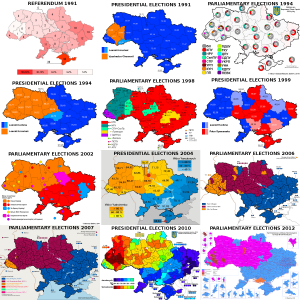
Ukrainian election maps, 1991-2012

Ukraine: Election maps for all the main elections since 1991

For convenience’s sake, I gathered electoral maps for all the presidential and parliamentary elections in those twenty years (as well as the 1991 independence referendum), in one big overview file. All of those maps are from Wikimedia/Wikipedia.

(One contestable editorial decision I made for the 2012 parliamentary elections was in choosing the map that showed the leaders in multi-member districts by constituency, rather than the one showing the leaders in single-mandate constituencies, which includes a lot of independents and is therefore less clear. I also couldn’t find a map of the results for Gorbachev’s All-Union referendum in 1991.)

Oddly, the candidates actually running for presidential office sometimes seemed irrelevant to the geographic divide itself. In 1991, the former dissident Viacheslav Chornovil was the worthy but politically weak candidate who won only in the Galician northwest of the country, while former apparatchik Leonid Kravchuk based his landslide victory on wide support in the south and east. But in 1995, the roles were reversed: Kravchuk won constituencies across the north and west when he lost his reelection bid against Leonid Kuchma, who swept the vote in the south and east. Those elections marked the first real time that the electoral map showed a dividing line right down the middle of the country that would start marking election maps again in every major election after 2002. But it gets stranger still: move on to 1999, when Kuchma faced a Communist Party candidate as opponent in his reelection bid — and it was Kuchma who won almost all of the north and west, while support for the communist candidate was based mostly in the south and east.

Considering Chornovil’s, Kravchuk’s and Tymoshenko’s losses, and the gritted teeth with which many voters in Kiev and the northeast must have voted for Kravchuk in ’94 and Kuchma in ’99, it’s hard to elide the thought that this pattern illustrates how the real political power in the country has lain in the south/east. The voters in the north/west have had to choose between voting for the lesser evil or rebelling in the streets. Yushchenko’s victory would be the only exception, and that took a revolution. I doubt that Viktor Yanukovich will ever switch to being the northwest’s candidate, though …

There is one further geographic wrinkle of note in these maps, and that is how the Transcarpathian/Ruthenian region constitutes a bit of an outlier within the northwestern half of the country. That’s the region midway on the left side, where the country’s borders take a turn east to curve around Romania, which is often coloured differently from all the surrounding territories. It can’t be a coincidence that the historical background of that region is wholly separate. Whereas the rest of northwestern Ukraine used to belong to the Polish-Lithuanian Commonwealth, and much of it to interbellum Poland as well, this region belonged to the Austro-Hungarian empire until WW1, and to Czechoslovakia between the two world wars.

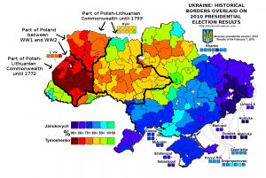
When it comes to elections, history can be destiny. A map overlaying the borders between Imperial Russia and Imperial Germany on the Polish election results of 2007 has done the rounds online among map geeks for a few years because of the striking correspondence it reveals. And on a Reddit thread about these Ukrainian election maps, commenter Martin Keegan pointed out that “the boundary is where the old Polish-Lithuanian – Russian border used to be,” an idea he previously proposed on his blog. That piqued my curiosity, so I ventured on an effort to do a similar overlay to the Polish one: how do the old Polish and Lithuanian borders with Russia overlap with Ukraine’s current political polarization?

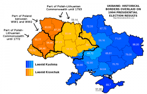
It was more of an effort than I’d have thought. But here is the result, overlaying different historical borders on the 2010 Presidential election results. It turns out that Keegan wasn’t entirely correct about the old Polish-Lithuanian – Russian border – but he definitely had a good point about the continuing salience of historical borders. Check out how the territory that still belonged to Poland in between the two world wars overlaps with the most overwhelming support for Tymoshenko (click the map to enlarge).


Historical borders and the 2010 Ukrainian election map

History as destiny? Historical borders superimposed on the 2010 Ukrainian election map

Moreover, Keegan’s point appears more vindicated when looking at the 1991 referendum results, though the division there was merely one between a large versus a near-unanimous majority in favour of idependence, or, especially, the 1994 presidential elections. Here is what the historical overlay looks like for the latter:


Historical borders and the 1994 Ukrainian election map

History as destiny, Pt. II? Historical borders superimposed on the 1994 Ukrainian election map


There are, however, also ways in which history is conspicuously not destiny. Or at least not in ways that are immediately obvious or make sense intuitively. Check out this map of the Holodomor – the genocidal, man-made famine that struck large parts of Ukraine, which is often blamed on indifference or outright malice on the part of Stalin and his regime. Compare it with the post-independence electoral maps, and any overlap is … hard to see. If anything, the Holodomor was most devastating in areas that now habitually side with Russia-friendly politicians like Yanukovich. Which doesn’t immediately make instinctive sense.

Methodological note:

The historical borders are approximate, though I did my best to be precise. As source material I used a map of Northeastern Europe around 1700; a Wikimedia map of the Polish-Lithuanian Commonwealth anno 1789; a Wikimedia map of Poland after the Second Partition of 1793; the detailed 1794 Laurie and Whittle map of the Kingdom of Poland; and an administrative map of Interbellum Poland in 1930. In addition, I used the Wikipedia page and subpages on the administrative raions of Ukraine,  and a detailed Ukrainian Wikimedia map of the electoral multimandate raions of the country. Delineating the far eastern border of the Polish-Lithuanian Commonwealth was a bit difficult since some settlements like the erstwhile Krylov that were right on the border back then have long been submerged in the Kremenchuk dam reservoir. In the south, the problem in defining how the historical border overlaps with current territories, lacking more detailed maps, lies with the transfer of Transnistria to Moldova.
3 Comments

Failure or success for the regime? The constitutional referendum results in comparison and the political geography of Egypt

International Politics, Politics
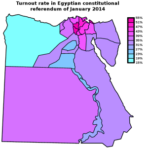
Map: Egypt 2014 constitutional referendum - Turnout by governorate

Egypt 2014 constitutional referendum - Turnout by governorate

Last Sunday, Egypt’s Supreme Electoral Committee announced the results of the referendum on the new constitution: no less than 98.1% of Egyptian voters had cast a vote in favour of the new text. That Eastern Block-style result should, however, be placed in the context of a turnout of just 38.6% — surely a less resounding affirmation of the new regime than the army would have hoped. Turnout reached up to 51-53% in the governorates of Menofiya and Gharbiya, in the Nile Delta, and Port Said; but it stayed under 24% in the governorates of Matrouh, Fayoum, and upriver in Sohag and Qena.

How does this result compare with the turnout and “Yes” vote in 2012, when it was the Muslim Brotherhood government that was pushing through a constitutional referendum? In addition, what does the turnout map reveal about the political geography of Egypt? The current referendum was of course boycotted by the Muslim Brotherhood, as well as by the most radical of the revolutionary groups, the April 6 Movement. The April 6 Movement is relatively small, however, and the constitution was supported by many other liberal and radical groups (and the extent of popular support for the liberal and leftist groups is in any case in doubt). So were the areas of low turnout correlated to areas of high support for the Muslim Brotherhood?

The trick in comparing the results of this year’s referendum with the one two years ago is that you’re dealing with two separate elements: the turnout, affected as it might be by boycotts and apathy, and the percentage of actual “Yes” voters. This year, turnout was low, at least by international standards, but almost everyone who went out to vote, voted “Yes”. (Considering the current climate of repression, opponents might also not have dared to come out to vote “No”). However, in the 2012 referendum turnout was even lower, at 32.9%, and in addition, there was a substantive number of people who came out only to vote against the Muslim Brotherhood’s constitution.

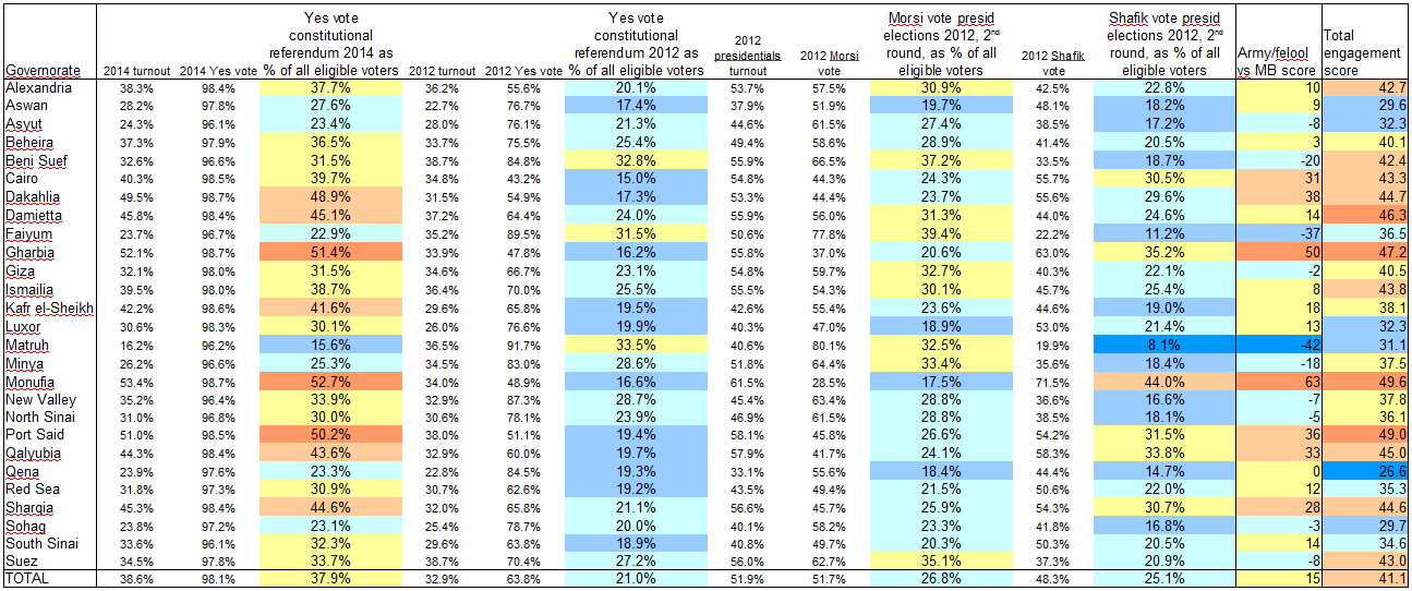
To take account of both elements, in the table below (click for full size), I’ve taken the turnout and “Yes” vote percentages in each referendum and calculated the number of “Yes” voters as percent of all eligible voters. I also did the same for the results of the second round of the 2012 presidential election, when Brotherhood candidate Mohamed Morsi faced off against Ahmed Shafik, widely associated with the ancien regime, army and “felool”.

Table: Egypt constitutional "Yes" votes of 2012 and 2014 in comparison

The constitutional "Yes" votes of 2012 and 2014 and the 2012 presidential election results (second round) in comparison, taking into account turnout rates

In short, especially when you take turnout into account, the army’s referendum this year fared much better than the Brotherhood’s proposal two years ago. Then again, context is important. The army inundated the airwaves and streets with propaganda, whereas even just carrying flyers against the constitution could get you harassed or arrested. Morsi’s government was repressive in its own ways, but the campaign back then wasn’t anywhere as one-sided, with the opposition holding public rallies in Tahrir Square and elsewhere. The direct comparison in this table shouldn’t therefore be taken simply at face value. One thing it can be useful for, I think, is to identify local and regional electoral patterns.

In the table above, I added two extra columns at the right end, based on formulae that I freely made up on the spot. I rather crudely labelled the first one the “Army/felool vs MB score”, which I know overly simplifies things. The formula is very straightforward:

Yes vote 2014 as percent of eligible voters + Shafik vote as percent of eligible voters - Yes vote 2012 as percent of eligible voters - Morsi vote as percent of eligible voters.

Egypt: "regime vs MB" score by governorate [Map]

"Regime vs MB" score: The Yes vote in the 2014 constitutional referendum and the Shafik vote in the 2010 presidential elections, minus the Yes vote in the 2012 constitutional referendum and the Morsi vote in the 2010 presidential elections (all as percent of all eligible voters)

By this calculation, the Faiyum and Matruh governorates are the only real Muslim Brotherhood strongholds, where Morsi and the 2012 referendum fared much better than nationally, and Shafik and the 2014 referendum fared much worse. Beni Suef and Minya follow at some distance. Those are also the only four governorates where a higher percentage of all eligible voters turned out to vote “Yes” in the 2012 constitutional referendum than in the 2014 one, though the difference in Beni Suef and Minya was small. (It might be worth noting, though, that Morsi didn’t win Matruh in the firstround of the 2012 presidential elections; it went for Abdel Moneim Aboul Fotouh, a former Brotherhood leader who built his campaign on a hybrid coalition of moderates and Salafis).

On the other hand, by this calculation, Monufia and Gharbia are by far the strongest army/establishment bulwarks, but Dakahlia, Port Said, Qalyubia, Cairo and Sharqia all rank highly here too.

There is another, less obvious dimension of these results though, which interested me when I noticed that the people of Aswan, Qena, Sohag and Luxor appear to not have particularly liked any of the choices. In these governorates, both the “Yes” vote in 2012 and that of 2014 (as percentage of all eligible voters) stayed below the national average. And turnout in the second round of the presidential elections there was low enough that both Morsi and Shafik failed to reach their national average score, as percentage of all eligible voters. That’s why I added that last column in the above table. I dubbed it the “engagement score”, but it’s really nothing more than just the average turnout in the three elections.

Egypt: "Engagement score" [Map]

Average turnout in the second round of the 2012 presidential elections, the 2012 constitutional referendum, and the 2014 constitutional referendum

Interesting to me is that Cairo and Alexandria actually rank somewhat highly on this score. All of the options on these ballots (the two draft constitutions and the candidates in the second round of the presidential elections) were disliked by some or all of the liberal and left-wing groups — which you’d expect to be be overrepresented in the two main cities. But if their supporters took part in the boycotts, it didn’t have a marked additional effect: turnout in the two cities was actually around or a little above average at each of these three times. Which is a lot more than can be said about the upstream and some of the out-country governorates. So this might further underscore the relative impotence of these groups. The call from some radical groups, like the Road of the Revolution Front, to take part in the 2014 referendum but vote “No” also obviously achieved little.

The correlation between the two above maps also suggests a strategic problem for the Muslim Brotherhood (though it is obviously more concerned with more immediate threats at the moment). Most of the governorates where the army/regime appeals least, judging on the 2014 results and Shafik’s 2012 result, also seem to be among the lesser-energized governorates overall, which weren’t particularly motivated to turn out by either of the two sides in these elections/referenda.

After all, Faiyum, Matruh and Minya didn’t just massively boycott the 2014 referendum; in 2012 turnout there was barely over the national average, and in the 2012 presidentials Morsi can’t have inspired them too much either, because turnout was either just around the national average or, in the case of Matruh, much below it. (Beni Suef is the exception, with an above-average ‘engagement score’).

Comments Off on Failure or success for the regime? The constitutional referendum results in comparison and the political geography of Egypt