For the third time in a year, on October 12, Hungary is having elections, this time for mayors and municipal councils. They’re predictably depressing, but I wrote a post about the contexts, data and implications over at Daily Kos Elections.
Observationalism
The referendum on Scottish independence last night ended up as the No camp hoped, the Yes camp had been trying not to think about, and almost exactly as I’d predicted, though I was certainly not alone. The result is an anti-climax after such excitement and absolutely unprecedented turnout, and it leaves election obsessives picking through the results.
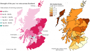
Here’s one thing that struck me: the Scottish National Party has become the major force in Scottish politics over the last decade or so, in Holyrood at least if not in Westminster. In the 2010 UK elections, the SNP received 19.9% of the Scottish vote, which was a good but hardly dominant result, but in the 2011 Scottish elections, the SNP won no fewer than 53 of the 73 single member constituencies, and 44.0% of the party vote – very close to the YES vote in the referendum (44.7%). The SNP was also, obviously, the major driver behind the referendum. So you’d expect a fairly close relation between the map of the 2011 SNP vote and the referendum vote. But nothing could be further from the truth.
I slightly adjusted the BBC map of the referendum results and the map of the SNP results in 2011 made by Antony Green for Australia’s ABC to make a direct comparison easier – with apologies to Shetland, which fell on the cutting room floor in the process. Click to enlarge:
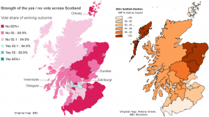
Ah, even better: Antony Green also made a map of the 2011 SNP vote by council area, which is the administrative unit by which the referendum results were announced. So that makes for a more direct comparison:
Keep in mind that dark on the referendum map means NO, whereas dark on the elections map means a high SNP vote – so you’d expect the dark (heavily SNP) regions on one map to match up with the light (low NO-vote) regions on the other map. But there’s no such relationship at all – North-East Scotland’s strong NO vote makes it almost looks like the opposite. If anything, due to the Glasgow-centered nature of the YES vote, there is more of an overlap with the map of the Labour Party’s 2011 results (even though Labour, of course, campaigned against independence).
Part of this is logical: Glasgow, the center of the YES campaign, where it succeeded in mobilizing an impressive number of mostly poor, disaffected people who normally don’t vote, is traditional Labour territory. All the more impressive that the pro-independence activists managed to get the city behind their cause.
But think about it: could the opposite then be true too? For example, the SNP won over 52% of the vote in the Moray, Aberdeenshire and Angus council areas in 2011. But yesterday only 42%, 40% and 44% respectively voted “Yes”, and these council areas made up a sizable 9% of the Scottish electorate. On the Western Isles, the SNP received over 52% of the 2011 vote, and Yes only 46.6%. In Perth & Kinross and Falkirk, the SNP received 48-52% of the vote in 2011, but Yes received just 47% of the vote in Falkirk, and a paltry 39.8% in Perth & Kinross. Especially when you consider that large numbers of Labour voters came out in favour of independence, as Glasgow shows, could this mean that a significant number of SNP voters came out against independence?
Not necessarily: after all, turnout was much lower in the Scottish elections – barely over 50%. For the referendum, it was a whopping 84.6%. So it could mean that in their own strongholds, the SNP voters were more alone than they must have felt: all those neighbours who normally don’t vote turned out to be heavily against independence. That would still make for a geographic anomaly though, because it would mean that the habitual non-voters who did come out to vote now were much more unionist-minded in SNP strongholds than their peers in other council areas. That’s possible, but not intuitive.
For what it’s worth, Lord Ashcroft’s overnight poll of 2,000 Scots found that 14% of those who voted for the SNP in the 2010 British elections voted NO yesterday. That’s 14% of the just 20% of Scottish voters who opted for the SNP in the Westminster elections. One might reasonably speculate that the share of NO voters among the much larger pool of those who voted for the SNP in 2011 was significantly larger still.
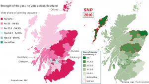
Comparing the geographical spread of the Yes vote in the referendum with the SNP result in the UK elections of 2010 is less relevant, considering the much smaller share of the vote the SNP received in those elections. But for the sake of being complete I’ve used a map made by The Economist for a side-by-side comparison on that one too:
Completely off-topic, but Reddit turned up an interesting chart about the correlation between disposable income and the “No” vote by region. Not sure if it’s original content by the submitter or credit for the original creator was withheld; Google turns up no alternative sources of the image.
21 September: Helping to solve the mystery
Stephen Fisher did great work explaining what seemed like a paradox in this post at his blog Elections Etc. The TLDR is:
Only after controlling for the effects of socio-economic circumstances is there such a clear relationship between the Yes vote and SNP support. [S]ocio-economic factors seemed to be more important factors than prior nationalist support.
The reader comments by James in the comments section provide more helpful detail.
Despite its populist image, the governing Fidesz party is still very much a bourgeois party, at least in Budapest. Conversely, electoral support for the far-right Jobbik in Budapest tends to be stronger the poorer a neighbourhood is. On the other side of the political playing field, the five-party socialist/liberal opposition alliance had roughly equally strong (or weak) support in wealthier and poorer districts alike. But when those parties run separately, their support reveals very differing geographic patterns.
All of this is suggested by a series of scatter plots I created, which chart the results of Hungary’s general and European elections earlier this year in Budapest’s 23 districts against gross income per capita levels in those districts. Check out the Infogr.am embedded below the fold – although you might prefer to view it on the Infogr.am website itself, where the charts are square as they are supposed to be rather than rectangular – that’s just the format of this blog distorting them a little.
Two qualifications should be made beforehand, however:
- The electoral geography of Budapest, as it relates to income levels, does not necessarily follow the same logic as that of Hungary as a whole. For example, in the European elections at least, the Socialist Party (MSzP) did seem to do better in the poorer, working class districts of Budapest than in the more prosperous ones. But at the same time, the party’s results in Budapest as a whole were the best it received across the country, even though Budapest is also the most prosperous region of the country. The relation between Fidesz and Jobbik votes and income levels in Budapest also appear to be quite different from how they work out in some of the other regions.
- The fact that a party does best in the richest (or poorest) areas doesn’t necessarily mean it also does best among the richest (or poorest) voters. The United States is the classic example of this paradox: Democratic presidential candidates tend to do best in the most prosperous states (e.g. the Bos-Wash corridor and the West Coast) and worst in the poorest states (e.g. the Appalachians and the Deep South). But exit poll after exit poll has confirmed that, although the correlation is becoming weaker over time, the party does better among lower-income voters and worse among higher-income ones. However, since we’re dealing with data by city district rather than by whole states here, such a paradox should be less likely to occur.
(One more small-print disclaimer: for income data by district I’ve relied on the Hungarian Central Statistical Office’s data regarding “Gross income serving as basis of the personal income tax per permanent population”. But the comparison between districts works out a little differently if you use its numbers on “Gross income serving as basis of the personal income tax per tax-payer”. I decided not to do that because it doesn’t take the large and varying number of non-tax payers in a district into account, for example the unemployed – and what about pensioners? – and this makes some of the districts with the highest non-active rates, like the 8th, look better-off than they are. But choosing the indicator “per permanent population” has its own effects; if you’re surprised to see Újpest ranking higher on the income axis than Zugló, for example, this is why, because the district has a high percentage of employed, working-age population (whereas Zugló, I assume, has more pensioners). Districts 17, 19 (Kispest) and 21 (Csepel) would also rank noticably lower with the alternative indicator.)
Continue Reading »
The populist right-wing Alliance for Germany (AfD) had a chance to repeat the success it enjoyed in state elections in Saxony two weeks ago in two state elections last Sunday, which both also took place in the former East-Germany. But in both Brandenburg and Thüringen, it went one better and got double-digit percentages. The AfD got 12% of the vote in Brandenburg (sometimes nicknamed “the small GDR”) and 10% in Thüringen.
Just like in Saxony, the AfD took votes from across the political spectrum, pollster Infratest Dimap revealed. In Thüringen, just like in Saxony, the Christian-Democratic CDU, Social-Democratic SPD and (ex-communist) Left Party all saw 5-6% of their 2009 voters switch to the AfD, while the liberal FDP and extreme-right NPD lost significantly larger shares of their electorates to the party.
On the bright side, the SPD in Brandenburg easily maintained their position as the state’s top party, though the Left Party, which had been their junior government coalition partner, lost a lot and booked its worst state elections result there since 1990. Nevertheless, just like last time, Brandenburg’s SPD is free to choose to govern with them or with the CDU; either combination would have a majority.
In Thüringen, weirdly, the SPD has the same luxury of being able to pick its coalition partner, even though they lost heavily and were left with just 12% of the vote. Both the CDU and the Left Party did well, cementing their positions at the top of the state’s party system, and they both want to govern – but neither of them can do it without the Social-Democrats. So it will either be a renewed CDU/SPD government, with a parliamentary majority of 1, or a Left Party/SPD/Green government, also with a parliamentary majority of 1.
The latter would of course be more ground-breaking and exciting, but oddly enough the three parties actually pooled less of the state vote (46.3%) than five years ago (52.1%), and obviously back then the Social-Democrats chickened out, even though they were promised the Prime Ministerial post by the (larger) Left Party. However, their chickening out last time round, and their stubborn refusal to express a preference for one or the other coalition option in this year’s campaign, led to them losing a fair amount of votes to the Left Party in these elections. So maybe they won’t do it again.
I won’t do a fully-fledged blog post, but I tweeted some interesting data I’ll collate them here:
Voter flows
- The Left Party in Brandenburg lost 19 thousand voters to the AfD, which attracted some attention; in part because of the curiosity of a stridently left-wing party losing voters to a populist right-wing party, and that not being an isolated phenomenon either, with far-left losing votes to far-right parties elsewhere as well; and in part because the AfD seemed to go out of its way to fish for Left Party votes. But to keep this in perspective: the Left Party also lost a whopping 119 thousand voters – six times as many – to the non-voter camp.
- Vice versa, the CDU in Brandenburg had a good night, overtaking the Left as the state’s second-largest party for the first time since 1999, but nevertheless also lost 19 thousand votes to the AfD, meaning that the CDU lost a larger share of its 2009 voters to the AfD than the Left Party did.
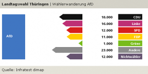
- The AfD in Thuringen also pulled votes from across the political spectrum, as this chart shows. (The “Andere” category here includes 10,000 votes the AfD pulled from the NPD.)
- What these numbers mean is that the CDU lost 7% of its 2009 vote in Brandenburg, and 5% of its 2009 vote in Thüringen to the AfD; the Left Party lost 5% and 6%, respectively, of its 2009 vote in the two states to the AfD; and the FDP lost 14% and 12% of its vote, respectively, to the AfD. The SPD lost 6% of its 2009 vote in Thüringen to the AfD, but just 3% of its vote in Brandenburg.
Demographics:
- More data on who voted for whom: In both Thüringen and Brandenburg, the AfD’s best professional groups were workers and the self-employed. And in both states, the Left Party did best among the unemployed and pensioners.
- Here’s a worrying data point: for both the SPD and the Left Party, in both Brandenburg and Thüringen, the best age group was those over 60+. The fact that it’s true for both parties makes it all the more worrying about their long-term future in these East-German states. Meanwhile, the best age group for the AfD in both states was those between 25 and 34.
History:
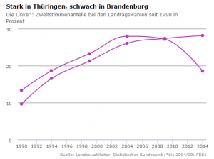
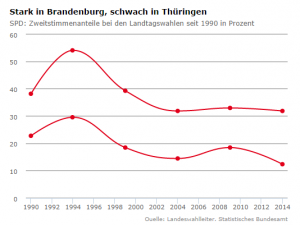
- A historical perspective: the Left Party booked its best ever result in Thüringen … and its worst result since 1990 in Brandenburg. The SPD booked its worst result in the postcommunist era in Thüringen, and ex aequo (with 2004) the worst in Brandenburg. The Greens got their best result in Brandenburg since 1990, and the FDP its worst result there ever. Surprisingly, the FDP in Thüringen has seen worse times still (1.1% in 1999). The Spiegel has a couple of interactive charts to explore some of those historical trajectories, and here are screenshots for two of them:
Last Sunday’s state elections in Saxony were marked by a low turnout, an only slightly eroded dominant position of the Christian-Democrats, and an imposing result for the right-wing, anti-system Alliance for Germany (AfD) party. The AfD was helped by the fact that these elections, the first state elections it ever took part in, took place in the very state where the party had already done best in the federal and European elections. Nevertheless, its 9.7% of the vote was remarkable and well beyond what the polls had foreseen.
Election night had its share of suspense as the extreme-right NPD hovered right around the 5% electoral threshold. It ended up missing it by a hair and getting 4.95%, which means it’ll be cast out of state parliament after ten years in its stronghold state.
There are several interesting geographic dimensions to the results, and I created an infographic at Infogr.am to share them. Below the fold, I accompany the Infogr.am charts with a few observations about what they show.
Continue Reading »
