The referendum on Scottish independence last night ended up as the No camp hoped, the Yes camp had been trying not to think about, and almost exactly as I’d predicted, though I was certainly not alone. The result is an anti-climax after such excitement and absolutely unprecedented turnout, and it leaves election obsessives picking through the results.
Here’s one thing that struck me: the Scottish National Party has become the major force in Scottish politics over the last decade or so, in Holyrood at least if not in Westminster. In the 2010 UK elections, the SNP received 19.9% of the Scottish vote, which was a good but hardly dominant result, but in the 2011 Scottish elections, the SNP won no fewer than 53 of the 73 single member constituencies, and 44.0% of the party vote – very close to the YES vote in the referendum (44.7%). The SNP was also, obviously, the major driver behind the referendum. So you’d expect a fairly close relation between the map of the 2011 SNP vote and the referendum vote. But nothing could be further from the truth.
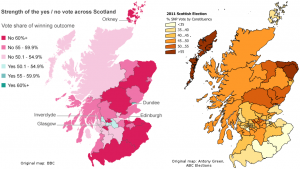
I slightly adjusted the BBC map of the referendum results and the map of the SNP results in 2011 made by Antony Green for Australia’s ABC to make a direct comparison easier – with apologies to Shetland, which fell on the cutting room floor in the process. Click to enlarge:
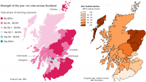
Ah, even better: Antony Green also made a map of the 2011 SNP vote by council area, which is the administrative unit by which the referendum results were announced. So that makes for a more direct comparison:
Keep in mind that dark on the referendum map means NO, whereas dark on the elections map means a high SNP vote – so you’d expect the dark (heavily SNP) regions on one map to match up with the light (low NO-vote) regions on the other map. But there’s no such relationship at all – North-East Scotland’s strong NO vote makes it almost looks like the opposite. If anything, due to the Glasgow-centered nature of the YES vote, there is more of an overlap with the map of the Labour Party’s 2011 results (even though Labour, of course, campaigned against independence).
Part of this is logical: Glasgow, the center of the YES campaign, where it succeeded in mobilizing an impressive number of mostly poor, disaffected people who normally don’t vote, is traditional Labour territory. All the more impressive that the pro-independence activists managed to get the city behind their cause.
But think about it: could the opposite then be true too? For example, the SNP won over 52% of the vote in the Moray, Aberdeenshire and Angus council areas in 2011. But yesterday only 42%, 40% and 44% respectively voted “Yes”, and these council areas made up a sizable 9% of the Scottish electorate. On the Western Isles, the SNP received over 52% of the 2011 vote, and Yes only 46.6%. In Perth & Kinross and Falkirk, the SNP received 48-52% of the vote in 2011, but Yes received just 47% of the vote in Falkirk, and a paltry 39.8% in Perth & Kinross. Especially when you consider that large numbers of Labour voters came out in favour of independence, as Glasgow shows, could this mean that a significant number of SNP voters came out against independence?
Not necessarily: after all, turnout was much lower in the Scottish elections – barely over 50%. For the referendum, it was a whopping 84.6%. So it could mean that in their own strongholds, the SNP voters were more alone than they must have felt: all those neighbours who normally don’t vote turned out to be heavily against independence. That would still make for a geographic anomaly though, because it would mean that the habitual non-voters who did come out to vote now were much more unionist-minded in SNP strongholds than their peers in other council areas. That’s possible, but not intuitive.
For what it’s worth, Lord Ashcroft’s overnight poll of 2,000 Scots found that 14% of those who voted for the SNP in the 2010 British elections voted NO yesterday. That’s 14% of the just 20% of Scottish voters who opted for the SNP in the Westminster elections. One might reasonably speculate that the share of NO voters among the much larger pool of those who voted for the SNP in 2011 was significantly larger still.
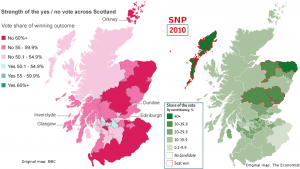
Comparing the geographical spread of the Yes vote in the referendum with the SNP result in the UK elections of 2010 is less relevant, considering the much smaller share of the vote the SNP received in those elections. But for the sake of being complete I’ve used a map made by The Economist for a side-by-side comparison on that one too:
Completely off-topic, but Reddit turned up an interesting chart about the correlation between disposable income and the “No” vote by region. Not sure if it’s original content by the submitter or credit for the original creator was withheld; Google turns up no alternative sources of the image.
21 September: Helping to solve the mystery
Stephen Fisher did great work explaining what seemed like a paradox in this post at his blog Elections Etc. The TLDR is:
Only after controlling for the effects of socio-economic circumstances is there such a clear relationship between the Yes vote and SNP support. [S]ocio-economic factors seemed to be more important factors than prior nationalist support.
The reader comments by James in the comments section provide more helpful detail.


