McCain 2008 = Gore 2000? Matching the numbers from Gallup, ABC, TIPP and Zogby

Politics, Presidential Elections, US Elections, US Politics

A fair bit of attention has been paid in the blogs today to the assertion of McCain’s chief strategist Steve Schmidt that “The McCain campaign is roughly in the position where Vice President Gore was running against President Bush one week before the election of 2000.” It’s met a good dose of scepticism. The WaPo drily annotated the quote as follows:

McCain’s team dismisses the most dire polls — those showing the race nationally with a double-digit lead for Obama. Advisers believe the contest’s margin is in the five-to-seven-point range, about the same deficit, they say, that then-Vice President Al Gore faced at this time eight years ago against then-Gov. George W. Bush. (A Washington Post poll at the same point in the 2000 race showed a tie.)

NBC’s First Read similarly remarked:

[T]he NBC/WSJ poll right before the election found Bush ahead by three among likely voters (47%-44%). But our most recent poll shows Obama up [..] 11 points among likely voters (53%-42%).

In addition, Marc Ambinder points out that the margins are “way different” state-by-state: “Obama’s doing much better in 2008 than Al Gore was in 2000 in the battleground states.”

Now I had a graph up here a week or two ago charting how Obama’s current Gallup numbers compare with the lead or deficit that Kerry, Gore and Clinton faced in the previous three presidential elections. In the days since, Googlers have found this site through at least 27 permutations of searches involving some combination around Gore, Bush, polls, October, historical, 2000, elections, tracking and Gallup. So this is a good occasion to update that post and expand it, not just looking at the Gallup numbers but also those from the ABC, Zogby and TIPP daily tracking polls from 2000, 2004 and 2008.

First off, that chart from last time, based on the Gallup polling numbers from the last four elections. Here’s the update:

Continue Reading »
2 Comments

History as farce

European Politics, Politics

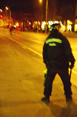
Budapest riot police, 2007I’ve given up on chasing after the riots like I used to (texts, photos), but the national holidays and commemorations which they unvariably adorn here in Hungary still have an eerie quality. Living downtown, you have the sound of the choppers hovering overhead all day and night long — and when you venture out in the evening, the boulevard is cordoned off and a convoy of cop cars and vans filled with riot police sirens past.

A quick glance at the usual breathless minute-by-minute reporting by the right-wing Magyar Nemzet newspaper suggests that an overpowering police presence this time stifled the would-be rioters – a generation yearning to emulate the heroic fights of its grandparents, doomed to imitate them as farce. At what cost they are succeeding is another question.

Update: Police did find “three petrol-fuelled explosive devices with timers attached” in the boot of a passenger car by Budapest’s Western Railway Station.

On the other hand, there was a rare occasion of, let’s say, civic intervention:

A group of 200, most of whom were wearing ski masks covering their faces, moved on to join a World Federation of Hungarians gathering in another part of the city when residents of a nearby building doused them with an unidentified liquid probably water. They responded by throwing rocks at the offending apartments.

That’s a first, I think.

2 Comments

Too. Many. Daily tracking polls. Update, 22 October.

Politics, Presidential Elections, US Elections, US Politics

The last daily tracking polls update I posted was on 8 October. That’s a lot of daily tracking poll results ago. Yet the bottom line is that nothing much has changed since.

On 8 October, the three-day running average of the daily tracking polls had Obama in the lead by 7%. Today, it has him in the lead by 7.1%. And in the meantime the clock is ticking on, and the window of opportunity for McCain to still close the gap is rapidly closing (or has it already closed?).

One major thing has changed though: there are ever more of the damn things. Daily tracking polls I mean. It seems like no self-respecting pollster can do without one this year (and to think that Gallup didn’t even have one in 2004!).

In early October you already had the long-running Gallup and Rasmussen ones, the Research 2000 one (sponsored by the Daily Kos) and the poll sponsored by Hotline and the alcoholic drinks business Diageo, conducted by FD. Zogby and Reuters started their own on 7 October; Investors Business Daily and the pollster TIPP followed on 13 October, and as of last Monday, ABC and the Washington Post present one as well.

daily tracking polls

Chart 1: All daily tracking polls

If you’re keeping a graph and you were basing any kind of trendline on the average of all daily tracking polls, this – well – sucks. Because every new poll comes with its own house effect, deviating from the others in its own ways. Zogby, for example, started off showing a 2-point lead for Obama when Rasmussen, Gallup and R2000 had it at 8-11 points. Then, just as the Zogby poll had settled nearer to the average, the IBD/TIPP poll came on the market showing Obama in the lead by just 2 points, when the other pollsters had it at 4, 5, 6, 10 and 12 points, respectively. And just when Rasmussen, Zogby, IBD/TIPP and Hotline agreed on a 4-5 point Obama lead last Monday, the ABC/WaPo jumped in with its own tracking poll showing a 9-point lead.

Finally, there was Gallup, on 12 October, providing no longer just data for registered voters, but separate numbers for not just one, but two distinct “likely voter” samples as well, one encompassing a larger universe of voters than the other.

Seriously, you would be put off posting new graphs too.

Which of the three sets of Gallup numbers do you feature? How do you deal with how the ups and downs in your average reflect some new poll having been added into the mix as much as any genuine shift in the numbers? And how meaningful do any of the numbers still seem anyway, when on almost any given day the five-to-nine sets of numbers you’re looking at have Obama’s lead anywhere between 3 and 11 points? (And that’s just the daily tracking polls!)

Chart 1 above, if you click it to enlarge, shows how messy and, by implication, uncertain it all is. The pollsters are all over the map in pinpointing Obama’s lead. But saying that is also identifying the obvious commonality. Every one of the daily tracking polls has Obama in the lead, and that’s been true since 17 September, over a month ago.

How big is that lead though?

Continue Reading »

2 Comments

Being European

Culture, European culture(s)
Sarkozy: no postmortem welcome in Bucharest. (Image from Flickr user oaspetele_de_piatra under CC license.)

Sarkozy: no postmortem welcome in Bucharest. (Image under CC license: Flickr user oaspetele_de_piatra.)

My colleague told me she’d called one of the people in our network today, a personal friend of hers too.

He happened to be in Romania, for some meeting or conference. He’s French, works in Brussels, and was quite surprised to stroll into a park in this Romanian town that was named after Charles de Gaulle.

Flippantly, he asked the taxi driver whom he hailed to take him back, so … what? In thirty years, will you have a Sarkozy Park?

The cabbie didnt skip a beat answering, a little brusquely: No — he’s Hungarian.

Comments Off on Being European

Quote of the day: McCain’s Village People

Uncategorized

Christopher Orr on TNR’s blog The Plank:

Joe the Plumber, your time is evidently up. America, meet the new physical embodiment of the McCain candidacy, Tito the Builder. (I wish I were joking.) These days, the McCain campaign is starting to resemble nothing so much as a reunion of the Village People.

Comes with a comment of the day from “kenshap”:

Who’s next,  Mao the fireman?

4 Comments

These two parts of the country count for equal shares of the vote

Politics, Presidential Elections, US Elections, US Politics

A propos of nothing in particular, an electoral map of sorts.

I selected all the states where McCain is currently leading, if even by the narrowest of margins, and painted them red (using the gadget at 270towin.com). To be generous and cautious, I actually used the pollster.com numbers from a week ago, when he was still leading in Missouri and North Dakota as well. And I selected the states that are absolutely foolproof safe for Obama and painted them blue.

These two selections count for almost exactly the same share of the Electoral College. These two selections represent roughly the same proportions of the US population.

A useful map, then, perhaps, to have at hand for two occasions:

a) Whenever someone harangues you about “the real America”, “heartland America” or “flyover country, where Joe Sixpack lives”.

Check: the Bos-Wash corridor with upstate NY and Vermont; Illinois; and the Pacific coast with Hawaii – together those states have as many Americans as all the even marginally red states together.

b) When you want to wonder at how unfavourable the underlying fundamentals of this race are for McCain.

Normally you start from a base level of reliable support, and then contest as many of the few remaining battleground states as you need to win. But this base level is just precariously low for McCain this year. Mostly because of a few givens: Bush’s unpopularity, the economic crisis and the loss of trust in the Republican brand on the economy, the unpopularity of the Iraq war. (And that’s not just “headwind”, as you’ll now find some conservatives describing it; it’s the result of Republican mismanagement.) But it’s also because of the Obama campaign’s willingness to reach far into red-state America and its access to the resources to do so, a testament of Democratic enthusiasm.

Either way, North Carolina, Virginia, Colorado and Florida are not part of the base level of support that Republicans can build on like they were in 2004. Which means that the Republican base level is as low as 185 Electoral College votes, rather than 249. And just 185 EVs? That’s so little that it barely counterweighs even the safest of safest blue states.

Again, nothing particularly newsworthy about any of this, but I still found it a pretty telling map.

Comments Off on These two parts of the country count for equal shares of the vote

We interrupt this program for another adorable bulletin

Politics, Presidential Elections, US Elections, US Politics

This one courtesy of Christina Bellantoni’s blog at the Washington Times; shot at an Obama rally in Fayetteville, NC. File under “adorable kids for Obama”; enough to make one feel hopeful about the future.

Comments Off on We interrupt this program for another adorable bulletin

The red and blue states of white* America (*and hispanic)

Politics, Presidential Elections, US Elections, US Politics

On his blog, Brian Beutler remarked upon the difference between the popular perception of California as a bastion of liberal group think and the reality:

California’s a much different kind of “blue” state than is, say, Massachusetts. The dense population centers outside of San Diego and Orange counties are liberal enough to give California’s electoral votes to the Democrats every four years. But for the most part the rest of the state is bright red.

He emphasised the stark contrast between blue and red counties and concluded that in this sense, aside from the San Diego and Orange counties, California “rightfully belongs” in the same category as Oregon and Washington.

While praising Beutler’s post, Ezra Klein offers a somewhat different take. There may be a real contrast between the blue coast and the red inlands, but what it’s informed by is primarily ethnic demography:

The state’s political transformation in recent years has been somewhat ideological, but it’s been much more demographic. Namely, it’s been driven by Latino immigration. Folks think of California and conflate its politics with San Francisco and Hollywood. White, affluent, cultural liberals. But that’s not why California is reliably blue. In 2004, Bush had a five percent margin among white voters.

This sets California apart from a state like Washington, he continues:

In the aggregate, whites everywhere are somewhat conservative. But in other liberal states, they really do swing left. In Washington, Kerry had a six percent advantage among whites. In Vermont, he had an 18 percent advantage. [..] California, by contrast, is a very Democratic state, but somewhat less coherently liberal. It’s solid blue because Latinos are solid blue, not because the place is packed with liberals.

This had me thinking. On a national electoral map, when placed on a scale from clear blue to bright red, California and Washington are the same pale blue. But if the white vote in those states differs so clearly, does it look different elsewhere too? How different would the map of red and blue states look when only showing the white vote?

The 2004 Presidential election – national vote (all groups)

This map of the 2004 election results is not the type youve seen everywhere: the country is not artificially divided up between blue and red states. Instead, it shows the degrees in between. A state where Bush won 100% would be fiery red, a state where Kerry won every vote would be the coolest blue, and a state where the vote was divided equally is white.

This map of the 2004 election results is not the usual type: the country is not artificially divided up between "blue" and "red" states. Instead, it shows the degrees in between. A state where Bush won 100% would be fiery red, a state where Kerry won every vote would be the coolest blue, and a state where the vote was divided equally is white.

Read on and view the map for white voters only beneath the fold.

Continue Reading »

2 Comments

Sometimes a chart is worth 1,000 words

Economy, Politics, US Economy, US Politics

This one comes via Kevin Drum at Mother Jones:

GDP growth vs. median wage stagnation

Yes – between the beginning of 2002 and the end of 2006, the United States GDP grew by over 15% – while the median wage flatlined, not going up by a single percent. In short, the country got ever richer – but the middle class saw nothing of that wealth. It was pocketed in its entirety by the wealthiest, with an assist from the tax cuts that the Bush administration heavily slanted in their favour.

Are there any recent historic precedents of such a disconnect, in which double-digit national economic growth was not accompanied by any improvement whatsoever for the average American? Was it this bad under Reagan, or Thatcher?

Pondering these numbers, Drum approvingly quotes an article by Joe Klein on Time’s blog Swampland: “We have had 30 years of class warfare, in which the wealthy strip-mined the middle class.” He adds:

For three decades we’ve artificially kept middle class wage increases far below the growth rate of the economy, and this trend has been even more pronounced over the past eight years. This has created an enormous pool of extra money that’s been — yes — strip mined and redirected to the rich, and fixing this is Barack Obama’s biggest and longest-term challenge.

If we restore the normal growth of middle class wages, it provides a sustainable consumer base for the entire economy; it reduces the demand for endless credit card debt; it brings down income inequality naturally; and it goes a long way toward keeping the financial sector under control and reining in Wall Street salaries without putting in place a bunch of artificial (and probably fruitless) regulations. [..] Stop the strip mining and economic vigor will follow. It’s at the core of everything.

UPDATE: Lane Kenworthy, a Professor of Sociology and Political Science at the University of Arizona, had a blog post earlier this month that traces the trend further back, to the Reagan era: Slow Income Growth for Middle America (h/t to A2K user Hawkeye). The pattern is pretty devastating – and he’s got a telling graph too:

Continue Reading »

4 Comments

The ups and downs of the ground game campaigns: “We’re votin’ for the n***er!”

Debates, International Politics, Politics, Presidential Elections, Uncategorized, US Economy, US Elections, US Politics

Alex Massie featured an encouraging dispatch from a Democratic operative in Ohio last Wednesday: The Ground Game: The View From Ohio. It’s impressive stuff:

I got placed in Bowling Green, right by Bowling Green State University. [..] The county is a swing county, but that is mostly because there are 50,000 rural families and 25,000 Bowling Green residents combined with 25,000 Bowling Green students. [..] No candidate has carried Ohio without carrying Wood County (BG is the county seat). One would think that this historical oddity would almost mandate a heavy McCain presence, but alas there is none to speak of.

I spent a little bit of time at the Obama state HQ in Columbus yesterday. It was jaw dropping. They had taken over an old mega-church. The first floor was a warren of staffers running around all very young and all very busy. The basement was probably the size of a supermarket, lined with table after table. Each table was staffed by four youngsters, all responsible for a different city, county, task etc. It looked like the command center for a massive army. No windows, no natural light, but filled with kids who probably had no idea it was 8am all hovering over computers, maps, data sheets. There were 600 staffers there, all dedicated to Ohio, at 8am. I’m amazed.

Phonebanking for Obama

Volunteers phonebanking in San Francisco (Images used under CC license from Flickr user SanFranAnnie)

In another recent dispatch from the trail, the Denver Post emphasised the mindboggling extent to which the ground games of both campaigns are driven by sophisticated micro-targeting:

Continue Reading »

Comments Off on The ups and downs of the ground game campaigns: “We’re votin’ for the n***er!”

Spread the wealth around!

Debates, Media / journalism, Politics, Presidential Elections, US Economy, US Elections, US Politics

One of the oddest features about Wednesday’s debate was John McCain’s repeated, dismissive references to how Obama wants to “spread the wealth around”. McCain repeated that line no less than nine times, each time derisively, and nine times is a lot in a debate like this. In comparison, he mentioned “education” six times, and “health insurance” three times (which Obama mentioned ten times).

(By the way, if you’re looking for Wordles of the two candidates’ words during the debate, like the ones I made for the second debate, check out these ones that Flickr user spudart made.)

I was actually looking whether there was a YouTube video splicing together all his “spread the wealth around” lines. Because if I knew how to edit videos, I’d make one. I mean, just go to the wonderful NYT interactive election debates tool, type in “spread” in the neat search box above the coloured bars, and use the forward and play buttons to the right to switch between all the references. It’s wonderfully bizarre. (OK, maybe you have to be a geek.)

M J M

Wages have stagnated for a decade .. For most folks, spreading the wealth probably seems like a good idea. (Image used under CC license from Flickr user M J M)

The weird thing about these invocations is that, as Noam Scheiber pointed out, he “repeatedly invoked Obama’s line about ‘spreading the wealth around’ without explaining what makes it so offensive (beyond his own menacing tone).” As Scheiber adds, “it didn’t strike me as self-evidently damning.” Right. I mean, God forbid anyone would want to spread the wealth – give other people a shot at it too. As Ezra Klein adds, “Median wages have stagnated for a decade … For most folks, spreading the wealth around probably seems like a good idea.”

McCain got the quote from Obama’s answer to “Joe the Plumber” (who isn’t actually a licensed plumber, doesn’t actually make $250,000 and wouldn’t have to pay higher taxes under Obama’s plan even if he did buy that company), when they met during a campaign stop. It’s worth watching the whole answer Obama gave. There’s nothing particular controversial in his answer as a whole, and the “spreading the wealth” line came in the context of giving people who are where Joe was earlier in his life tax cuts so they would be helped making it too. But as Campaign Diaries points out, the McCain campaign wants you to see the line as “code words for socialism”.

The thing is that McCain didn’t actually bother to make that argument in the debate. He appeared to think that just repeating the line would make people go, “oh yeah, that’s terrible – spreading the wealth around, how can he say such a thing – he must be a socialist”. This equation strikes me as typically one of those things that only works within the bubble. Maybe because for most people, a $250,000 income is so far removed from their world, they can’t even imagine. After all, it’s just the top 3% who earns that much. It’s five times the median household income, and eight times the median individual income.

It is not far removed, however, from the lives of those reporting on politics for us. For network TV reporters, for pundits and politicians, for anchormen and talk show hosts, it’s not that much. They do know people who make that much, because they are often among the top earners in America themselves. So for them, it hits close to home. And because pundits and anchormen hang out with other pundits and anchormen, their view of what is normal is warped – for a striking example see the video below the fold. And this has serious consequences for the opportunities to market liberal economic policies.

Continue Reading »

3 Comments

An, um, inventive attack …

Presidential Elections, US Elections, US Politics

Spotted on YouTube:

“It’s true: Barack is a secret SMOKER… He’s too WEAK to quit. WHY would we want to elect such a WEAK man PRESIDENT?”

Reality defies parody.

1 Comment
« Older Posts
Newer Posts »