… but is it really a good idea for a major company to convert its logo into an erect penis? (Or reveal the existing erect-penisness of its logo, as the case may be?)

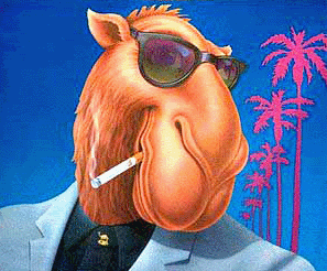
Joe Camel: An early example of the effective use of penis fear in advertising. (Nose = penis. Not erect though.)
This was playing on TV during a nice, innocuous show about doggies on Animal Planet. It’s not one of those edgy web-only ads you see when you’re reading the Onion or something. (Speaking of the Onion, I immediately remembered their 1989 cover story, “Penis Fear,” which exposed the subliminal use of penises in advertising. Joe Camel was featured prominently. I tried to find that story online but the only references were made by a) me, and b) a guy who said he kept the issue for years and then his wife threw it out. The noive.)
If it were an advertisement for, I dunno, mattresses or something, I could maybe understand it. Ha ha. Clever. But a restaurant?
 I mean, I see it now… the Arby’s logo sure does look like (a rather stumpy) erect penis. Or maybe a partially unrolled condom.
These are really associations they want to create?
(I almost titled this “I Don’t Have Anything Against Erect Penises” but thought that might be a bit too much…)