Browsing the archives for the geography tag.

Posting elsewhere: Mapping election results in Budapest; photos of New York City, then and now

European Politics, History, International Politics, US culture

Elsewhere online:

Comments Off on Posting elsewhere: Mapping election results in Budapest; photos of New York City, then and now

Party preference and income levels in the districts of Budapest: Elections 2014

European Politics, International Politics, Politics

Despite its populist image, the governing Fidesz party is still very much a bourgeois party, at least in Budapest. Conversely, electoral support for the far-right Jobbik in Budapest tends to be stronger the poorer a neighbourhood is. On the other side of the political playing field, the five-party socialist/liberal opposition alliance had roughly equally strong (or weak) support in wealthier and poorer districts alike. But when those parties run separately, their support reveals very differing geographic patterns.

All of this is suggested by a series of scatter plots I created, which chart the results of Hungary’s general and European elections earlier this year in Budapest’s 23 districts against gross income per capita levels in those districts. Check out the Infogr.am embedded below the fold – although you might prefer to view it on the Infogr.am website itself, where the charts are square as they are supposed to be rather than rectangular – that’s just the format of this blog distorting them a little.

Two qualifications should be made beforehand, however:

  1. The electoral geography of Budapest, as it relates to income levels, does not necessarily follow the same logic as that of Hungary as a whole. For example, in the European elections at least, the Socialist Party (MSzP) did seem to do better in the poorer, working class districts of Budapest than in the more prosperous ones. But at the same time, the party’s results in Budapest as a whole were the best it received across the country, even though Budapest is also the most prosperous region of the country. The relation between Fidesz and Jobbik votes and income levels in Budapest also appear to be quite different from how they work out in some of the other regions.
  2. The fact that a party does best in the richest (or poorest) areas doesn’t necessarily mean it also does best among the richest (or poorest) voters. The United States is the classic example of this paradox: Democratic presidential candidates tend to do best in the most prosperous states (e.g. the Bos-Wash corridor and the West Coast) and worst in the poorest states (e.g. the Appalachians and the Deep South). But exit poll after exit poll has confirmed that, although the correlation is becoming weaker over time, the party does better among lower-income voters and worse among higher-income ones. However, since we’re dealing with data by city district rather than by whole states here, such a paradox should be less likely to occur.

(One more small-print disclaimer: for income data by district I’ve relied on the Hungarian Central Statistical Office’s data regarding “Gross income serving as basis of the personal income tax per permanent population”. But the comparison between districts works out a little differently if you use its numbers on “Gross income serving as basis of the personal income tax per tax-payer”. I decided not to do that because it doesn’t take the large and varying number of non-tax payers in a district into account, for example the unemployed – and what about pensioners? – and this makes some of the districts with the highest non-active rates, like the 8th, look better-off than they are. But choosing the indicator “per permanent population” has its own effects; if you’re surprised to see Újpest ranking higher on the income axis than Zugló, for example, this is why, because the district has a high percentage of employed, working-age population (whereas Zugló, I assume, has more pensioners). Districts 17, 19 (Kispest) and 21 (Csepel) would also rank noticably lower with the alternative indicator.)

Continue Reading »

Comments Off on Party preference and income levels in the districts of Budapest: Elections 2014

Of sideshows, curiosities and structural changes: Everything you ever wanted to know about this year’s local elections in the Netherlands (and probably quite a bit more)

European Politics, International Politics, Politics

Update: see also this post about the provincial elections of 2015 in the Netherlands – it has better maps and dives into some electoral history as well.

It’s not easy for local elections in a country the size of The Netherlands to make the international news. But if there’s anyone who can make it happen, it’s the peroxide-blonde leader of the Dutch far right Freedom Party, Geert Wilders. And that’s what he did, on March 19, when the municipal election results were being tallied.

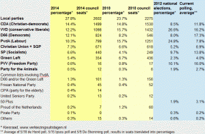
2014 Municipal election results, the Netherlands

Click to enlarge: 2014 municipal election results

Orating to a Freedom Party rally in The Hague, Wilders asked his supporters to give “a clear answer” to three questions that he was going to ask them; three questions that “defined our party”. “Do you want more or less European Union?”, he started off. Less, less, his supporters chanted enthusiastically. Second question: “Do you want more or less Labour Party?” Again, the crowd clapped and chanted: “less, less!”. So Wilders moved on to the third question. “I’m really not allowed to say this,” he started, but “freedom of expression is a great value … so I ask you, do you want more or fewer Moroccans, in this city and in the Netherlands?” The crowd, elated, chanted back: “Fewer, fewer, fewer!”, and with a sly little smile Wilders remarked, “then we’ll go and arrange that”.

Which got the Dutch election night headline space from the BBC to The Guardian, from the Times of Israel to Al-Jazeera, and from Fox News to the Huffington Post.

All of which was pretty unfair, considering that Wilders’ Freedom Party (or the PVV, as the Dutch call it) had been something of a non-entity in the whole local elections campaign. The party had refrained from taking part in the elections altogether in all but two municipalities: The Hague, the seat of the Dutch government, and Almere, a large town in Amsterdam’s commuter belt. Moreover, as was mentioned in almost none of these stories, it actually lost votes in both cities.

Continue Reading »

4 Comments

A weak tide, that’s not lifting all boats: median household income in the Unites States then and now

Economy, Uncategorized, US Economy

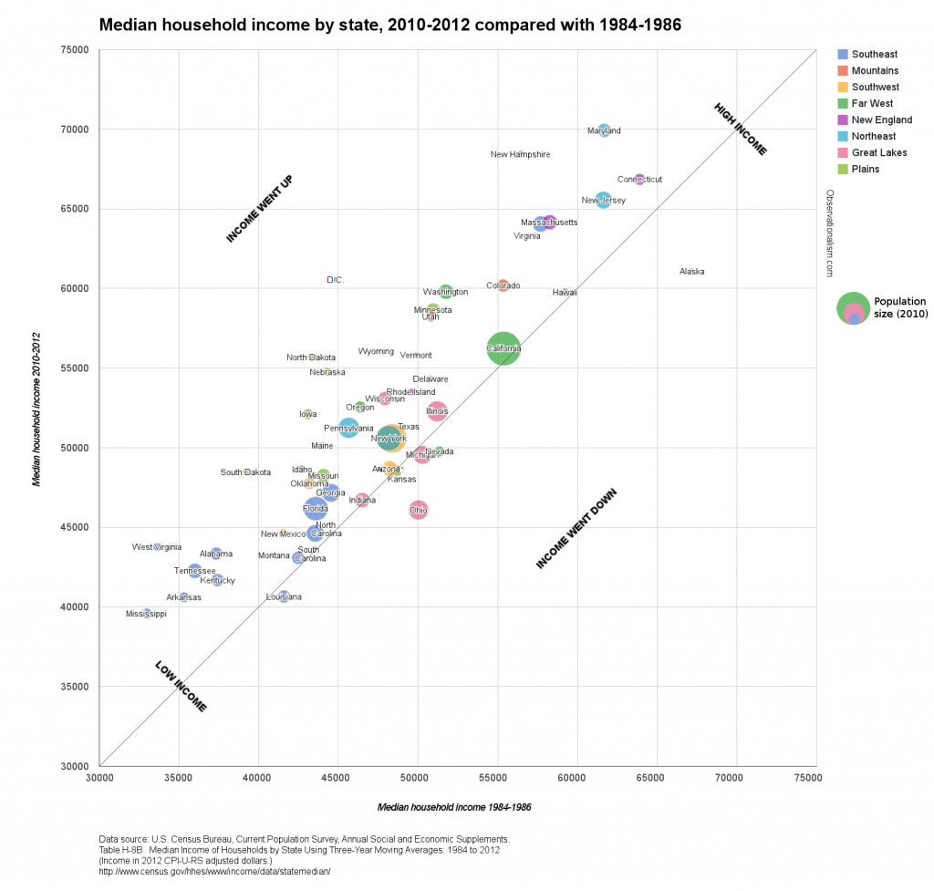
From 1984-1986 up through 2010-2012, the US Census Bureau maintained three-year average data on median household incomes by state, as part of its Annual Social and Economic Supplement. To see how even, or uneven, the growth in that median income has been from state to state, I decided to take that first and last data point and compare the changes. Which states progressed the most – and which the least?

The result is this chart ‒ you’ll need click to enlarge, otherwise you won’t see much (and here is the data as PDF). Size of the bubbles represents 2010 population size.

Chart: Median household income by state, in 1984-1986 and 2010-2012

Click to enlarge: Median household income by state then and now

My interest in this data related primarily to the discussions about stagnating middle class wages in the US; over the years I’ve seen the subject come up time and again that especially male, middle or working class individuals, and most especially those working in manufacturing, are hardly or no better off now than they were in the mid- or late 1970s. This US Census Bureau data set about median household incomes doesn’t quite confirm that, but the national growth it does show, in inflation-adjusted dollars, between 1984-1986 and 2010-2012 is hardly impressive: an anemic 6.2% in 26 years. In addition it should probably be kept in mind that the data set only starts out after the depression of the early 1980s and some 5 years of Ronald Reagan’s administration, which coincided with a rapid increase in income inequality.

The list of the states with the lowest median household income in 2010-2012 was not surprising: starting at the bottom, it’s Mississippi, Arkansas, Louisiana, Kentucky, Tennessee and South Carolina. Montana has the lowest median household income outside the South, whereas West Virginia, perhaps surprisingly, is only the ninth-poorest state by this measure.

The comparison with the ranking and proportions 26 years earlier yields some surprises. In no fewer than six states, the median household income was higher then, than it is now. In an additional five states, the median household income in 2010-12 is at most $1000 higher (in 2012 CPI-U-RS adjusted dollars). These near-dozen states include:

  • Three midwestern states with lots of (former) industry, as you’d expect: Ohio, Michigan and Indiana. Ohio suffered the deepest cuts of the Lower 48, with a median household income that was 7.9% lower in 2010-12 than in 1984-86. Michigan, too, ended up with an actual decrease in median household incomes.
  • Three states in the southwest: California, Nevada and Arizona. Maybe the influx of Latino immigrants, many of whom now survive on low wages, is dragging the median down? Nevada now has a lower median household income than in the mid-80s.
  • Two states in the Deep South (Louisiana and South Carolina); as well as Kansas, Alaska, and Hawaii. Alaska was down the most of all states, actually, though even now it still ranks in the top 10.

The states where median wages in 2010-12 were at least $8,000 higher than 26 years earlier include:

  • In the BosWash corridor, New Hampshire and Maryland. Those two states have ended up with the highest median wages of the country (booming exurbs?). But the largest growth of all the U.S., at +$15,714 and +35.1%, was in Washington DC, which has transformed unrecognizably since Marion Barry’s glory days and the crack epidemic.
  • North Dakota ‒ location of a remarkable oil boom ‒ has seen the nation’s second largest growth in median household income: +$12,385 or +28.6%. Nearby Wyoming also benefits from its flourishing extractive industries, as well as the growth in tourism. (In comparison, it’s striking that Alaska’s median income is down by so much, considering that it’s another state whose economy is disproportionally dependent on oil, gas and mining.)
  • Elsewhere in the Upper Midwest, however, South Dakota, Nebraska and Iowa also all saw well above-average growth in median household incomes. I’m grasping for explanations here, but maybe that has involved the tail end of the long process in which small family farms died out (and the farmers’ sons and daughters moved to the city) and were replaced by large-scale, prosperous agro-industrial farms?
  • Washington state (Microsoft, Boeing, Amazon and/or Starbucks?) … as well as West-Virginia. Which surprised me. West-Virginia had the second-lowest median wages of the nation in ’84-86, ahead of only Mississippi; now it has the ninth-lowest, higher than states like Montana and Tennessee.

The above visualization is the result of generating a bubble chart within Google Spreadsheets, and then processing it in GIMP to add the diagonal line and labels, as well as to pull apart the labels for individual states where the Google chart had superimposed them over each other.

For an automatically generated alternative, I also tried using TableauPublic, and the resulting chart looks a lot more sleek: Median Household Income by State, 1984-196 vs. 2010-2012. It lacks explanatory labeling and a diagonal line to help you orient yourself though. The program is free, but if you’re using it for the first time it takes a bit of figuring out ‒ you’re really going to need the instructions. Once you get a grasp on the basics, though, a chart like this is extremely easy to create.

I found maps a little more complicated to make in TableauPublic, especially compared with using the “geomap” option when creating charts in Google Spreadsheets. But since the Google Geomap won’t show on this blog, I did it anyway. Here are the maps showing the data on median household income by state in 1984-1986, in 2010-2012, and the difference between those two years. I’m afraid Alaska and Hawaii got cut off (another reason to prefer Google Spreadsheets’ geomap, where they are neatly scaled and repositioned to fit into a simple U.S. view), though you should still be able to use the zoom functions to reveal them.

Comparing the maps, it seems to me that the contrast between the BosWash corridor and the surrounding country has grown only more pronounced. You can clearly see the relative decline of the industrial Midwest. The South remains the worst off, as the TableauPublic bubble chart illustrates well too, though the poorest Southern states are also the ones that have caught up with the others the most – with states like Alabama, Tennessee and West-Virginia catching up with the Carolinas and Louisiana. The West remains a bit of a patchwork, meanwhile, with Colorado, Utah and Wyoming, blessed with higher median household incomes, putting some distance between themselves and Montana, Nevada, Arizona and New Mexico.

Comments Off on A weak tide, that’s not lifting all boats: median household income in the Unites States then and now

Ukraine: Did the protest movement transcend historical borders?

Culture, European culture(s), European Politics, International Politics, Politics

“Even in the president’s heartlands, in Eastern Ukraine, protesters have come out in strong support of ‘Euromaidan’,” two British academics argued last week on the Washington Post’s political science blog The Monkey Cage, and they drew a far-reaching conclusion: “In effect, Russophones and Ukrainophones, the East and West of the country, young and old, ethnic Russians and Ukrainians [have] united against – what they increasingly regard as – the illegitimate rule of the president and his party”.

A similar note was struck in a slideshare that’s circulating on Facebook, called What is really happening in Ukraine, which has been viewed over 650.000 times. Citing “massive protests” arising in the East and the South on January 26, the creators chide the Western press for a tendency to continue portraying the protests “in cold war terms,” as “fundamentally based on ‘ethnic/language’ splitting in Ukraine”.
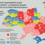
Ukraine, 26 January 2014: occupations, seizures and protests

Map of the situation in Ukraine, 26 January 2014, Sergii Gorbachov

Both arguments came with maps. The Monkey Cage contributors,  Kataryna Wolczuk and Roman Wolczuk,  presented a map from the Centre for Eastern Studies in Warsaw, which colours most of the country orange (“occupied state administration buildings”) or brown (“mass protests”). The slideshare used three of Sergii Gorbachov’s detailed maps, presenting the situation on January 25-27. On his map from January 26, 21:00, just two of the country’s provinces remained Yanukovych-blue: Donetsk and the Crimea. The rest of the country was in the grip of the revolution: local state administrations were “occupied by [the] people” or the object of “attempted seizures” or “mass protests”.
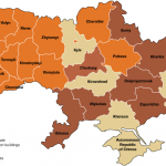
Ukraine, 29 January 2014: occupations and protests

Map of the situation in Ukraine, 29 January 2014, Centre for Eastern Studies

Those maps look very different from the one posted by Max Fischer in the Washington Post just a couple of days earlier, under the title “This is the one map you need to understand Ukraine’s crisis”. Fischer’s map of the regional divide running down the centre of Ukraine between the protesting North and West of the country and the non-protesting South and East neatly overlapped with those of various post-independence election results — and moreover, as I wrote and mapped out last week, with ancient and more recent historical borders as well. So did something fundamentally change, in the last two weeks?

Kataryna Wolczuk and Roman Wolczuk seem to believe so, when they go beyond describing the protests in the South and East as “unprecedented and until recently inconceivable” to describe “the East and West of the country” uniting against Yanukovych. The slideshare authors obviously also believe that analyses that still focus on ethnic/language divides are out of touch with the changing environment.

There are two questions about this argument: To what extent were they right, concerning the developments as they unfolded in the last days of January? And to what extent do any such changes last today?

Protesters in the East: How much of a force?

Poland’s Centre for Eastern Studies, which created the map used in the Monkey Cage blog post, summarized the state of the Ukrainian protests on January 29 in a detailed briefing, covering events across the country. When it came to developments in the South and East, it reported that “demonstrations numbering several thousand and blockades of offices also took place in Dnepropetrovsk, Zaporozhye, Odessa, Cherkassy and Lugansk.”

Map of Ukraine with main cities

Cities of Ukraine (Wikimedia)

By then the Centre had already published more detailed write-ups of ongoing events in the previous few days. Its briefing of the 27th cited “massive numbers of participants” in “protests in the largest cities of southern and eastern Ukraine”, which “reached unprecedented proportions”. Detailing the specifics, however, the briefing reported that “several thousand people” took part in an anti-government demonstration in Dnipropetrovsk, a “four-thousand-strong rally” was held in Sumy, a “demonstration of several hundred people” was dispersed in Zaporizhia, “2–3 thousand people” took to the streets in Odessa, “more than one thousand” people demonstrated in Kirovohrad, and so on. Reuters reported “up to 5,000 anti-government protesters” picketing the regional government  headquarters in Zaporizhia. The Centre for Eastern Studies’ briefing from a day later added a few details: “a one-thousand strong demonstration” was held in Luhansk, “which may be viewed as another sign of a civil ‘awakening’ of people in eastern Ukraine”; but meanwhile, in Kharkiv, Luhansk, Dnipropetrovsk and Zaporizhia “attempts at occupying administration buildings have been effectively and brutally countered by the police and groups of “titushky”‘.

Even if only a few thousand people took part in those various protests, that may indeed have been unprecedented; after all, in Luhansk for example, Yanukovych received over 80% of the vote in the last presidential elections. The local, Yanukovych-friendly administrations and oligarchs usually keep these cities on a tight reign. But does “several thousand” really equate with “massive,” let alone indicating that the East and the West are finally uniting against the current government? Kharkiv, Dnipropetrovsk and Odessa have a million inhabitants each; Zaporizhia has over 800,000. The same Reuters story reporting on the protest in Zaporizhia also interviewed an opposition journalist admitting that the local protests only attracted the educated middle class: “Unfortunately, Euromaidan’s appeal is very limited here”.

Not all these places are the same either. Sumy and Kirovohrad went for Tymoshenko over Yanukovych in the last elections, so it isn’t all that surprising that opposition protests would break out there. In fact, for two cities with 250,000-300,000 inhabitants which voted for Tymoshenko, a few thousand protesters doesn’t immediately impress, although Sumy protesters did occupy the city’s council building. The size of protests is also sometimes overstated – by both sides, for different reasons. A reporter from the Putin-critical Russian newspaper Novaya Gazeta observed a peaceful protest rally in Kharkiv where no attempts were made to storm the regional government building: “Most of the participants were students,” she said, “just half a thousand very young and unprepared kids who did not prepare for an assault at all”. Yet afterwards she saw on TV that an opposition politician was telling a Kyiv rally that “at this very moment protestors are blocking regional state administrations” in Kharkiv – and that the mayor of Kharkiv, from Yanukovych’s party, was threatening protesters that they shouldn’t involve themselves in a “war,” as they would be assured to lose it.

Violence and loathing on the streets

No doubt, the threat of violence and intimidation will have kept many away. Police used tear gas and smoke grenades, and “young men armed with baseball bats” attacked anti-government protesters in Kharkiv. In Zaporizhia,  men “with white ribbons on their shoulders were walking around the city and beating people”, a local journalist reported. The BBC linked to videos showing vigilante titushki, armed with seemingly identical batons, gathering inside a Dnipropetrovsk government building and then rushing out to viciously beat up demonstrators. The local Governor later called these men “representatives of the region’s public organisations”, calling “everything … perfectly legal.”

Vice versa, eighteen policemen were injured in Dnipropetrovsk alone, according to regional authorities. A blogger in Donetsk described “hired thugs” being transported in on buses to stage mock street riots and “imitate assaults at official buildings,” presumably “to frighten people here and … mobilize their voters,” but it’s not as if actual attacks on administrative buildings by anti-Yanukovych protesters have been lacking in graphical violence of their own, as this disturbing footage from a Central-Ukrainian city illustrated.

Anti-government protesters in Kharkiv and Dnipropetrovsk talked to France24 about their motivations on January 27th. “[I]n Kharkiv we’ve been having protests every day since November 22,” said Natalka Zubar – but it’s tough going. “Here in eastern Ukraine, [..] Russian TV is even more popular than Ukrainian TV, and every day its anchors talk about LGBT people controlling all of Europe, spreading sodomy, things like this. They claim all protesters are hooligans. But I think that more and more people have stopped listening.”
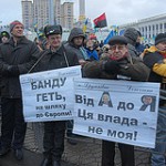
Protesters from Donetsk at Euromaidan

Protesters from Donetsk at Euromaidan in Kyiv (Photo by spoilt.exile, creative commons)

Protests in Dnipropetrovsk started two months ago, added Pavlo Khazan, and “there had been no major incidents [..] until Sunday”. That day, however, “some protesters decided that we should go to the regional administration building. [..] When we arrived, we were shocked to see that, behind a line of police officers guarding the building stood hooligans armed with sticks and baseball bats. The police let them attack us, and then dispersed the crowd [..] and began making arrests.”

The slideshare touting the protests’ strength makes mention of football fans several times. There’s a long history of politics and football mixing, and Ukraine offers a new episode. Local fans of Metalist Kharkiv and Dnipro Dnipropetrovsk protected demonstrators from attacks by aggressive pro-government groups, AFP reported on the 31st, along with even fans of Shakhtar Donetsk, in Yanukovych’s own hometown. “We came to support our people in fighting for their rights,” explained some of a group of about 60 Shakhtar fans in central Donetsk.

Already back in mid-January, professor Alexander J. Motyl wrote a piece extolling the bravery of anti-government protesters in Donetsk: “at first, it was only a small group of about 20 to 30 demonstrators who repeatedly assembled at the Shevchenko monument [..]. Then, a few weeks ago, several hundred brave protesters [..] carried pro-democracy, pro-Europe, and anti-Yanukovych banners in a march through downtown”. Motyl argued that even these small numbers had the local establishment spooked, and compared the demonstrations with Martin Luther King’s civil rights marches through Alabama: “For 500 marchers to assemble in Donetsk is the equivalent of 50,000 in Lviv or 500,000 in Kyiv.”

Is it? In symbolic terms, maybe. But not necessarily in terms of measuring the balance of public opinion across the regions.

Fathoming public opinion

The Ukrainian Center for Social and Marketing Research SOCIS last week released the results of a poll it conducted between 17 and 26 January. They don’t include any regional breakdown, but the overall results are instructive. The opposition is definitely on an upswing: Klitschko ‘s UDAR, the pro-Tymoshenko Fatherland party, Solidarity, and the far-right Freedom party are pooling some 58-60% of the vote among them in both parliamentary and presidential match-ups. That’s about 10% more than these parties received in the 2012 parliamentary elections. (The parties now rallying in the streets already actually received a narrow majority of the vote back then, but lost out big in seats because of their divisions.)

Support for Yanukovych’s Party of the Regions, however, has barely lessened. The party would get 29% of the vote in parliamentary elections, and he himself is polling at 29-30% in presidential match-ups. In 2012, the Party of the Regions received almost exactly the same share of the vote: 30%. Instead, it’s the Communist Party which lost some of its vote, polling at 8% when it received 13% in 2012, and the largest shifts are actually taking place within the opposition camp, with Fatherland (down to 20%) and Freedom (down to 7%) losing out to UDAR (up to 24%) and Solidarity (9%). In addition, some 30% of the full, initial sample answered that they wouldn’t know who to vote for.

Yanukovych’s party won the 2012 elections by racking up 65% of the vote in the Donetsk region, over 50% of the vote in Lugansk and the Crimea, and some 40% of the vote in the regions of Kharkiv, Zaporizhia, Odessa and Mykolaiv. And the Communists hauled in 18-25% of the vote in those same regions. If the Party of the Regions remains at strength and the Communists hold on to at least half of their vote, as this new poll suggests, then a majority of those who have an opinion in these regions are likely still in their camp. In the Dnipropetrovsk region, the Party of the Regions and the Communist Party pooled 55% of the vote in 2012 while Fatherland, UDAR and Freedom added up to 38%, so if shifts are taking place roughly proportionally around the country, that region too would at best be evenly divided now.

In the same poll, respondents were given a straight choice between entry into the EU and entry into a Customs Union with Russia, Belarus and Kazakhstan. A plurality of 43% chose for the EU, but 32% preferred the Customs Union (with the rest offering no answer), and that latter number will be proportionally higher in the East and South. These numbers suggest that little has actually changed. In openDemocracy, Valery Kalnysh recapped polling data from late December, when the Euromaidan protests were already ongoing but hadn’t yet escalated, and they showed that 50% of Ukrainians then supported Euromaidan while 42% did not, and that opponents were far in the majority in the East, by 65% to 30%. Tellingly, that poll had also shown support for not just the opposition leaders, but also Yanukovych going up since October, from 19% to 29% – suggesting that far from Yanukovych’s south-eastern base suffering erosion, the increasing polarization of the country was shoring it up. A whole series of polls by different pollsters between May and November 2013 had showed a similar balance of opinion, with support for EU access consistently at 41-47% and, with the one exception of a November poll, support for the Customs Union at 31-40%.

Rallying the counterforces: local authorities and the “titushki”
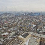
A view of Donetsk

A view of Donetsk (Photo by Vladimir Yaitskiy, creative commons)

In some regions, the mere prospect of increasing protest did seem to change some of the political dynamics. In Odessa, the Kyiv Post reported, the local administration and opposition struck a truce of sorts, a “non-aggression, mutual supportiveness deal”. But elsewhere  in the South and East, any challenge to the grip of Yanukovych loyalists seems to have been beaten back. On February 1, the Kyiv Post reported that local authorities in Dnipropetrovsk had detained two opposition party members for allegedly “plotting a terrorist attack at a national energy system facility”. In the Crimea, the regional parliament banned the Freedom party, though it was forced to reverse its decision on February 7. As January ended, one reporter found no more protests in Donetsk, just a middle-aged local scoffing: “Euromaidan? To hell with that!”. Organizers of a protest picket had cancelled it out of fear of further violence. Two local activists of the nationalist Freedom party had left Donetsk on the 27th, explaining that “we feared that emergency rule would be imposed so that nobody can leave the region”.

The regional deputy head of UDAR said that party activists throughout Donbass have been receiving threatening text messages on their mobile phones, and dismissed local pro-Yanukovych protesters as titushki, “hired thugs” and “former inmates”. An in-depth portrait of the “titushki” phenomenon for Foreign Policy describes these roaming groups of violent youths as an actually well-organized, 20,000-strong national force, complete with internal hierarchies, materially supported by riot police, and motivated by daily government pay-offs, Soviet and military-inspired loyalties to the state, ties to powerful organized crime groups with a vested interest in corrupt ruling politicians, and plain old criminal tempers.

Anton Davydchenko, the leader of a group called National Unity in Odessa which claims to have rallied over 1,000 volunteers, all ready to take up arms against anti-government protesters if necessary, would presumably recognize some of these descriptions and take issue with others. “We will never give them our cheek to be slapped. If they come to us with weapons, we will meet them with weapons,” he told RFE/RL. Like local authorities in Donetsk and Lugansk did with similar groups (described as including “Cossacks and Afghanistan war veterans”), local authorities are supporting the group.
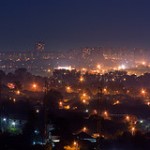
Night over Kharkiv

Night over Kharkiv (Photo by Aleksandr Osipov, creative commons)

In Kharkiv, a conference of provincial Party of the Regions officials called for establishing a new organization called the “Ukrainian Front” – after the Soviet Army campaign that drove Nazi Germany out of Ukraine in WWII – at the suggestion of an Afghanistan veterans group. “‘The Front will purge and cleanse the Ukrainian land from anyone who has come here as an occupier,” orated the governor of Kharkiv: its participants “will follow their fathers’ and grandfathers’ example in freeing our lands, like in the 1940s”. (If that sounds alarming, it doesn’t help that many protesters in Kyiv have actually embraced the imagery of Stepan Bandera, who declared an independent Ukrainian State during WWII, and the  Ukrainian Insurgent Army (UPA), which committed war crimes and at times collaborated with Nazi Germany during its battle for independence.) Kharkiv’s eccentric mayor, Hennady Kernes, riffed on the same theme when approving of the local pro-Yankovych martial arts club Oplot, which has been accused of ties with the kidnapping and torture of Auto-Maidan leader Dmytro Bulatov: “I know these sportsmen,” he has said: “they are against allowing ‘Banderovtsy’ to come to Kharkiv and I support this”.
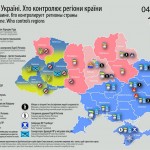
Protests in Ukraine - situation by region, February 4

Map of the situation in Ukraine, 4 February 2014, Sergii Gorbachov

All in all, the authorities in the South and East seem to have succeeded in beating back any challenge which local protesters posed to their position in late January. The last time Sergii Gorbachov posted an updated map was on February 4, and all the South and East had reverted back to Yanukovych-blue, with added icons indicating the appearance of pro-Yanukovych demonstrators, Party of Regions brigades and violent “titushki” as well as local protesters.

Change: up to moguls or mobs?

In the end, if the protest movement is to crack the South and East in a meaningful way, it may not be up to the protesters themselves. It will have to be up to elements in the political class itself — “and no one within that class is more powerful than Ukraine’s oligarchs, the billionaire business tycoons who together own a vastly disproportionate share of the country’s wealth,” as Sergii Leshchenko wrote in Foreign Policy. They won’t be motivated by political idealism, but by self-interest, needing the doors to the EU to stay open, stability to return to the country, and themselves not to be targeted by financial and visa sanctions to protect their wealth. Leshchenko recounts how a second oligarch, Viktor Pinchuk, switched to supporting the opposition in December – and he’s from Dnipropetrovsk.

The others, however, are still hedging their bets, at best – and it would have to be someone like Rinat Akhmetov, Ukraine’s richest man and still powerful in his native Donetsk, to really overturn the dynamics. Lesser moguls will not do, as two of the richest businessmen in Dnipropetrovsk found out after January 25. That day, Hennadiy Korban and Borys Filatov decided to air live broadcasts of the antigovernment protests in Kyiv on a large outdoor screen at a shopping mall they owned, and hoist the flags of the EU and Ukraine at their local properties. Hours later, the New York Times recounted, the electricity was suddenly cut to all their three shopping malls. Four days later, a local judge ordered “that Mr. Korban be detained and interrogated as a witness in connection with a previously dormant investigation of a 2012 murder”. Then, state security officers raided the premises of the businessmen’s accountant for “bombs or other evidence of terrorism”. The two men have now relocated to Israel.

Enduring divisions

With the iron grip of local authorities from Yanukovych’s camp in the South and East seemingly barely letting up, for now, and indications that a majority of the population there is still on the opposite side from Euromaidan’s activists (who themselves are hardly unified), the question arises how much future there is for a unitary state so bitterly divided. The dividing lines today are, after all, not very different from the borders of previous eras – could they become real borders of one kind of another again? The Ukrainian Communist Party has floated a trial balloon: Ukraine as federal state. Dividing Ukraine up into seven large states, each with its own parliament, would pull the country back from the brink of civil war and prevent the country from falling apart, the communists argue. But the opposition, not altogether without reason, is likely to see this as a mere Russian strategy to break up the state and seize the South and East.

Despite the initial enthusiasm about unprecedented demonstrations in the East illustrated by the Monkey Cage blog post, it seems in fact unlikely that “Russophones and Ukrainophones, the East and West of the country, [..] ethnic Russians and Ukrainians” will really unite against the political forces represented by Yanukovych any time soon. On February 4, a week after the small protests in the South and East crested, an AP report concluded that “two months into Ukraine’s anti-government protests, the two sides are only moving further apart. [The protesters] appear unable to significantly broaden their movement into parts of the country where the opposition is weak, as some of the protesters use nationalist rhetoric that alienates even liberal eastern Ukrainians.” As David Stern wrote in The Atlantic, even if Yanukovych does steps down, peacefully, and the opposition assumes power, “it too would not resolve Ukraine’s crisis. Political divisions, both within the country and the protest camp itself, will remain, and possibly become more pronounced” over time.
Comments Off on Ukraine: Did the protest movement transcend historical borders?

The geographical (and historical?) divisions underlying Ukraine’s political strife

European Politics, History, International Politics, Politics

As Washington Post blogger Max Fischer illustrated with what he called “the one map you need to understand Ukraine’s crisis”, the current protests and revolts in Ukraine are fierce, but largely limited to the north and west of the country, which is right in line with the pattern revealed in the 2010 election outcomes. It’s no secret that the same broad geographic divide appeared, time and again, in most of the elections since 1991, when Ukraine gained independence.

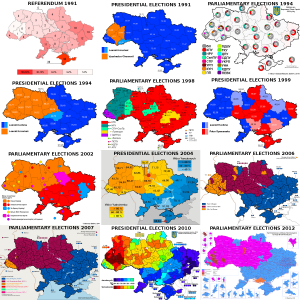
Ukrainian election maps, 1991-2012

Ukraine: Election maps for all the main elections since 1991

For convenience’s sake, I gathered electoral maps for all the presidential and parliamentary elections in those twenty years (as well as the 1991 independence referendum), in one big overview file. All of those maps are from Wikimedia/Wikipedia.

(One contestable editorial decision I made for the 2012 parliamentary elections was in choosing the map that showed the leaders in multi-member districts by constituency, rather than the one showing the leaders in single-mandate constituencies, which includes a lot of independents and is therefore less clear. I also couldn’t find a map of the results for Gorbachev’s All-Union referendum in 1991.)

Oddly, the candidates actually running for presidential office sometimes seemed irrelevant to the geographic divide itself. In 1991, the former dissident Viacheslav Chornovil was the worthy but politically weak candidate who won only in the Galician northwest of the country, while former apparatchik Leonid Kravchuk based his landslide victory on wide support in the south and east. But in 1995, the roles were reversed: Kravchuk won constituencies across the north and west when he lost his reelection bid against Leonid Kuchma, who swept the vote in the south and east. Those elections marked the first real time that the electoral map showed a dividing line right down the middle of the country that would start marking election maps again in every major election after 2002. But it gets stranger still: move on to 1999, when Kuchma faced a Communist Party candidate as opponent in his reelection bid — and it was Kuchma who won almost all of the north and west, while support for the communist candidate was based mostly in the south and east.

Considering Chornovil’s, Kravchuk’s and Tymoshenko’s losses, and the gritted teeth with which many voters in Kiev and the northeast must have voted for Kravchuk in ’94 and Kuchma in ’99, it’s hard to elide the thought that this pattern illustrates how the real political power in the country has lain in the south/east. The voters in the north/west have had to choose between voting for the lesser evil or rebelling in the streets. Yushchenko’s victory would be the only exception, and that took a revolution. I doubt that Viktor Yanukovich will ever switch to being the northwest’s candidate, though …

There is one further geographic wrinkle of note in these maps, and that is how the Transcarpathian/Ruthenian region constitutes a bit of an outlier within the northwestern half of the country. That’s the region midway on the left side, where the country’s borders take a turn east to curve around Romania, which is often coloured differently from all the surrounding territories. It can’t be a coincidence that the historical background of that region is wholly separate. Whereas the rest of northwestern Ukraine used to belong to the Polish-Lithuanian Commonwealth, and much of it to interbellum Poland as well, this region belonged to the Austro-Hungarian empire until WW1, and to Czechoslovakia between the two world wars.

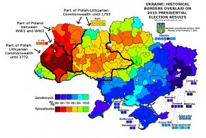
When it comes to elections, history can be destiny. A map overlaying the borders between Imperial Russia and Imperial Germany on the Polish election results of 2007 has done the rounds online among map geeks for a few years because of the striking correspondence it reveals. And on a Reddit thread about these Ukrainian election maps, commenter Martin Keegan pointed out that “the boundary is where the old Polish-Lithuanian – Russian border used to be,” an idea he previously proposed on his blog. That piqued my curiosity, so I ventured on an effort to do a similar overlay to the Polish one: how do the old Polish and Lithuanian borders with Russia overlap with Ukraine’s current political polarization?

It was more of an effort than I’d have thought. But here is the result, overlaying different historical borders on the 2010 Presidential election results. It turns out that Keegan wasn’t entirely correct about the old Polish-Lithuanian – Russian border – but he definitely had a good point about the continuing salience of historical borders. Check out how the territory that still belonged to Poland in between the two world wars overlaps with the most overwhelming support for Tymoshenko (click the map to enlarge).


Historical borders and the 2010 Ukrainian election map

History as destiny? Historical borders superimposed on the 2010 Ukrainian election map

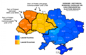
Moreover, Keegan’s point appears more vindicated when looking at the 1991 referendum results, though the division there was merely one between a large versus a near-unanimous majority in favour of idependence, or, especially, the 1994 presidential elections. Here is what the historical overlay looks like for the latter:


Historical borders and the 1994 Ukrainian election map

History as destiny, Pt. II? Historical borders superimposed on the 1994 Ukrainian election map


There are, however, also ways in which history is conspicuously not destiny. Or at least not in ways that are immediately obvious or make sense intuitively. Check out this map of the Holodomor – the genocidal, man-made famine that struck large parts of Ukraine, which is often blamed on indifference or outright malice on the part of Stalin and his regime. Compare it with the post-independence electoral maps, and any overlap is … hard to see. If anything, the Holodomor was most devastating in areas that now habitually side with Russia-friendly politicians like Yanukovich. Which doesn’t immediately make instinctive sense.

Methodological note:

The historical borders are approximate, though I did my best to be precise. As source material I used a map of Northeastern Europe around 1700; a Wikimedia map of the Polish-Lithuanian Commonwealth anno 1789; a Wikimedia map of Poland after the Second Partition of 1793; the detailed 1794 Laurie and Whittle map of the Kingdom of Poland; and an administrative map of Interbellum Poland in 1930. In addition, I used the Wikipedia page and subpages on the administrative raions of Ukraine,  and a detailed Ukrainian Wikimedia map of the electoral multimandate raions of the country. Delineating the far eastern border of the Polish-Lithuanian Commonwealth was a bit difficult since some settlements like the erstwhile Krylov that were right on the border back then have long been submerged in the Kremenchuk dam reservoir. In the south, the problem in defining how the historical border overlaps with current territories, lacking more detailed maps, lies with the transfer of Transnistria to Moldova.

3 Comments

Failure or success for the regime? The constitutional referendum results in comparison and the political geography of Egypt

International Politics, Politics
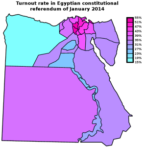
Map: Egypt 2014 constitutional referendum - Turnout by governorate

Egypt 2014 constitutional referendum - Turnout by governorate

Last Sunday, Egypt’s Supreme Electoral Committee announced the results of the referendum on the new constitution: no less than 98.1% of Egyptian voters had cast a vote in favour of the new text. That Eastern Block-style result should, however, be placed in the context of a turnout of just 38.6% — surely a less resounding affirmation of the new regime than the army would have hoped. Turnout reached up to 51-53% in the governorates of Menofiya and Gharbiya, in the Nile Delta, and Port Said; but it stayed under 24% in the governorates of Matrouh, Fayoum, and upriver in Sohag and Qena.

How does this result compare with the turnout and “Yes” vote in 2012, when it was the Muslim Brotherhood government that was pushing through a constitutional referendum? In addition, what does the turnout map reveal about the political geography of Egypt? The current referendum was of course boycotted by the Muslim Brotherhood, as well as by the most radical of the revolutionary groups, the April 6 Movement. The April 6 Movement is relatively small, however, and the constitution was supported by many other liberal and radical groups (and the extent of popular support for the liberal and leftist groups is in any case in doubt). So were the areas of low turnout correlated to areas of high support for the Muslim Brotherhood?

The trick in comparing the results of this year’s referendum with the one two years ago is that you’re dealing with two separate elements: the turnout, affected as it might be by boycotts and apathy, and the percentage of actual “Yes” voters. This year, turnout was low, at least by international standards, but almost everyone who went out to vote, voted “Yes”. (Considering the current climate of repression, opponents might also not have dared to come out to vote “No”). However, in the 2012 referendum turnout was even lower, at 32.9%, and in addition, there was a substantive number of people who came out only to vote against the Muslim Brotherhood’s constitution.

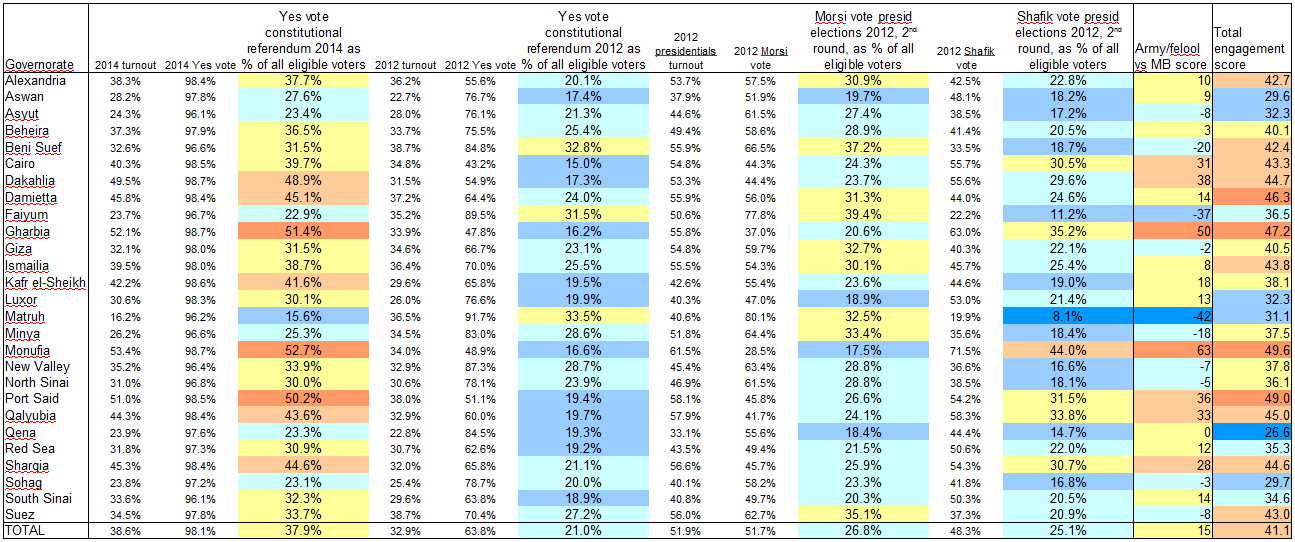
To take account of both elements, in the table below (click for full size), I’ve taken the turnout and “Yes” vote percentages in each referendum and calculated the number of “Yes” voters as percent of all eligible voters. I also did the same for the results of the second round of the 2012 presidential election, when Brotherhood candidate Mohamed Morsi faced off against Ahmed Shafik, widely associated with the ancien regime, army and “felool”.

Table: Egypt constitutional "Yes" votes of 2012 and 2014 in comparison

The constitutional "Yes" votes of 2012 and 2014 and the 2012 presidential election results (second round) in comparison, taking into account turnout rates

In short, especially when you take turnout into account, the army’s referendum this year fared much better than the Brotherhood’s proposal two years ago. Then again, context is important. The army inundated the airwaves and streets with propaganda, whereas even just carrying flyers against the constitution could get you harassed or arrested. Morsi’s government was repressive in its own ways, but the campaign back then wasn’t anywhere as one-sided, with the opposition holding public rallies in Tahrir Square and elsewhere. The direct comparison in this table shouldn’t therefore be taken simply at face value. One thing it can be useful for, I think, is to identify local and regional electoral patterns.

In the table above, I added two extra columns at the right end, based on formulae that I freely made up on the spot. I rather crudely labelled the first one the “Army/felool vs MB score”, which I know overly simplifies things. The formula is very straightforward:

Yes vote 2014 as percent of eligible voters + Shafik vote as percent of eligible voters - Yes vote 2012 as percent of eligible voters - Morsi vote as percent of eligible voters.

Egypt: "regime vs MB" score by governorate [Map]

"Regime vs MB" score: The Yes vote in the 2014 constitutional referendum and the Shafik vote in the 2010 presidential elections, minus the Yes vote in the 2012 constitutional referendum and the Morsi vote in the 2010 presidential elections (all as percent of all eligible voters)

By this calculation, the Faiyum and Matruh governorates are the only real Muslim Brotherhood strongholds, where Morsi and the 2012 referendum fared much better than nationally, and Shafik and the 2014 referendum fared much worse. Beni Suef and Minya follow at some distance. Those are also the only four governorates where a higher percentage of all eligible voters turned out to vote “Yes” in the 2012 constitutional referendum than in the 2014 one, though the difference in Beni Suef and Minya was small. (It might be worth noting, though, that Morsi didn’t win Matruh in the firstround of the 2012 presidential elections; it went for Abdel Moneim Aboul Fotouh, a former Brotherhood leader who built his campaign on a hybrid coalition of moderates and Salafis).

On the other hand, by this calculation, Monufia and Gharbia are by far the strongest army/establishment bulwarks, but Dakahlia, Port Said, Qalyubia, Cairo and Sharqia all rank highly here too.

There is another, less obvious dimension of these results though, which interested me when I noticed that the people of Aswan, Qena, Sohag and Luxor appear to not have particularly liked any of the choices. In these governorates, both the “Yes” vote in 2012 and that of 2014 (as percentage of all eligible voters) stayed below the national average. And turnout in the second round of the presidential elections there was low enough that both Morsi and Shafik failed to reach their national average score, as percentage of all eligible voters. That’s why I added that last column in the above table. I dubbed it the “engagement score”, but it’s really nothing more than just the average turnout in the three elections.

Egypt: "Engagement score" [Map]

Average turnout in the second round of the 2012 presidential elections, the 2012 constitutional referendum, and the 2014 constitutional referendum

Interesting to me is that Cairo and Alexandria actually rank somewhat highly on this score. All of the options on these ballots (the two draft constitutions and the candidates in the second round of the presidential elections) were disliked by some or all of the liberal and left-wing groups — which you’d expect to be be overrepresented in the two main cities. But if their supporters took part in the boycotts, it didn’t have a marked additional effect: turnout in the two cities was actually around or a little above average at each of these three times. Which is a lot more than can be said about the upstream and some of the out-country governorates. So this might further underscore the relative impotence of these groups. The call from some radical groups, like the Road of the Revolution Front, to take part in the 2014 referendum but vote “No” also obviously achieved little.

The correlation between the two above maps also suggests a strategic problem for the Muslim Brotherhood (though it is obviously more concerned with more immediate threats at the moment). Most of the governorates where the army/regime appeals least, judging on the 2014 results and Shafik’s 2012 result, also seem to be among the lesser-energized governorates overall, which weren’t particularly motivated to turn out by either of the two sides in these elections/referenda.

After all, Faiyum, Matruh and Minya didn’t just massively boycott the 2014 referendum; in 2012 turnout there was barely over the national average, and in the 2012 presidentials Morsi can’t have inspired them too much either, because turnout was either just around the national average or, in the case of Matruh, much below it. (Beni Suef is the exception, with an above-average ‘engagement score’).

Comments Off on Failure or success for the regime? The constitutional referendum results in comparison and the political geography of Egypt

Questions and answers

Culture, European Politics, Media / journalism, Politics, US culture, US Politics

First things first

Foremost (h/t The Plank): The question to guide your day-to-day life in this new era.

Rush Limbaugh, conservative giant

Also via The Plank: Who is Rush Limbaugh? According to Republican Congressman Phil Gingrey, yesterday, “it’s easy if you’re Sean Hannity or Rush Limbaugh or even sometimes Newt Gingrich to stand back and throw bricks. You don’t have to try to do what’s best for your people and your party. You know you’re just on these talk shows and you’re living well and plus you stir up a bit of controversy and gin the base and that sort of that thing.”

But he had that all wrong, he realised today, after some constituents helpfully called in to remind him. In reality, he corrected himself in a statement titled “Gingrey comments on Rush misunderstanding,” Rush Limbaugh is not just a “voice [..] of the conservative movement’s conscience”, but … a “conservative giant”.

Who are the hottest professors?

In love with your prof? If so, he/she is likely to lecture languages. There is “Real Social Scientific Data” (mind your footnotes) on the relative hotness of the different disciplines, which comes via Prof. Henry Farrell (Political Science, ranked fifth) at the Monkey Cage.

Law and criminal justice take a prominent second and fourth place (out of 36) in the ranking, which might please fellow blogger Joefromchicago. Unsurprisingly, engineering, computer science and chemistry rank at the bottom, so pity the poor professors in those duller disciplines — after all, tenure without temptation is like aspersions without alliteration.

Economists, however (ranked 30th) have reason to harbour hope, judging on Shivaji’s observation that they’re up next to be fetishized by pop culture:

After the phenomenal success of books such as Freakonomics, Undercover Economist, Armchair Economist [..], every economist is under pressure to come up with some innovative approach to explain mundane things in life. Forget earlier topics like “Why aid doesn’t work in Africa” or “Implications of direct cash grants on Philips curve” that used to keep economists intrigued; the best talent in business are now looking for more relevant topics. And even though some of the most pressing issues facing mankind such as “Overpricing of the hotel mini-bar” (Tim Harford) and “socioeconomic patterns of naming children” (Steven Levitt) have already been worked upon, there still remain some fundamental questions that remain unanswered. For example, “How many love songs are written for every break-up song and why” or “why do men wash underwear less frequently than women”, or “Why does Ronald McDonald not get fat”? 

Where are Americans moving to? And from?

Talking about comparative hotness – which states of the US are hemorrhaging homes, and which ones are rapidly reeling in the residents? Earlier this month, Patrick Ottenhoff dug into the demographics on domestic migration between 2000 and 2008, and put up a map on The Electoral Map. It’s not as simple as cities versus flyover country, he emphasises: loser states cover a contiguous chunk of territory from Massachusetts to Nebraska, while most of the states strongly gaining ground are clustered together in the West and on the Atlantic seaboard from Virginia to Florida.

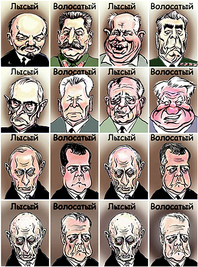
What’s the real reason Putin handpicked Medvedev for President?

Of course, or so the cheekier of conventional wisdoms go: term-limited out of the Presidential office, Putin needed someone to keep his seat warm while he played Prime Minister for a few years, so he could return to the Presidency soon enough. But why Medvedev?

Why, his luxurious head of hair of course. It’s the only way the steely-eyed leader could deal with the longstanding law of succession when it comes to ruling Russia. Lenin – bald; Stalin – hairy; Khrushchev – bald; Brezhnev – hairy; well, you get the idea. Gorbachev was bald, Yeltsin hairy, and well – let’s be honest, Putin isn’t particularly blessed in this regard.

By choosing Dmitry last year, Putin bent the Bald-Hairy Theory of Russian Leaders to his will to power – and the two can rule till death do them part.

1 Comment

WaPo/ABC Poll: the difference between white voters in the South and elsewhere

Politics, Presidential Elections, US culture, US Elections, US Politics

This bit of polling analysis caught my attention: Obama does well among whites, very, very well indeed. But with one glaring exception: the South. The Southern exception is alive and well:

Obama is outperforming any Democrat back to Jimmy Carter among white voters, getting 45 percent to McCain’s 52 percent. But in the South, it is a very different story. Obama fares worse among Southern whites than any Democrat since George McGovern in 1972.

My electoral map of how whites voted in 2004 already showed that when you single out white voters, it’s not Wyoming and Utah that are the most Republican states, it’s Mississippi, Alabama and South-Carolina. The latest ABC/WaPo poll suggests that even as whites across the country have been remarkably receptive to Obama’s message, those in the South are still very hostile:

Whites in the East and West tilt narrowly toward Obama (he’s up 8 and 7 points, respectively), and the two run about evenly among those in the Midwest. By contrast, Southern whites break more than 2 to 1 for McCain, 65 percent to 32 percent.

That stark divide is not simply a partisan difference. While white Democrats outside the South give Obama margins of 80 points or more, he leads by a more modest 65 points among white Southern Democrats. The Democrat is up 55 points among liberal whites in the region, far under his performance among those voters elsewhere, where he is up by 79 points.

Southern white independents are also far more likely than politically independent whites in other regions to support McCain: They break 62 to 33 percent in his favor. White independents in the West favor Obama by a similarly wide margin, 63 to 34 percent. White political independents in the East and Midwest divide much more evenly.

1 Comment

The red and blue states of white* America (*and hispanic)

Politics, Presidential Elections, US Elections, US Politics

On his blog, Brian Beutler remarked upon the difference between the popular perception of California as a bastion of liberal group think and the reality:

California’s a much different kind of “blue” state than is, say, Massachusetts. The dense population centers outside of San Diego and Orange counties are liberal enough to give California’s electoral votes to the Democrats every four years. But for the most part the rest of the state is bright red.

He emphasised the stark contrast between blue and red counties and concluded that in this sense, aside from the San Diego and Orange counties, California “rightfully belongs” in the same category as Oregon and Washington.

While praising Beutler’s post, Ezra Klein offers a somewhat different take. There may be a real contrast between the blue coast and the red inlands, but what it’s informed by is primarily ethnic demography:

The state’s political transformation in recent years has been somewhat ideological, but it’s been much more demographic. Namely, it’s been driven by Latino immigration. Folks think of California and conflate its politics with San Francisco and Hollywood. White, affluent, cultural liberals. But that’s not why California is reliably blue. In 2004, Bush had a five percent margin among white voters.

This sets California apart from a state like Washington, he continues:

In the aggregate, whites everywhere are somewhat conservative. But in other liberal states, they really do swing left. In Washington, Kerry had a six percent advantage among whites. In Vermont, he had an 18 percent advantage. [..] California, by contrast, is a very Democratic state, but somewhat less coherently liberal. It’s solid blue because Latinos are solid blue, not because the place is packed with liberals.

This had me thinking. On a national electoral map, when placed on a scale from clear blue to bright red, California and Washington are the same pale blue. But if the white vote in those states differs so clearly, does it look different elsewhere too? How different would the map of red and blue states look when only showing the white vote?

The 2004 Presidential election – national vote (all groups)

This map of the 2004 election results is not the type youve seen everywhere: the country is not artificially divided up between blue and red states. Instead, it shows the degrees in between. A state where Bush won 100% would be fiery red, a state where Kerry won every vote would be the coolest blue, and a state where the vote was divided equally is white.

This map of the 2004 election results is not the usual type: the country is not artificially divided up between "blue" and "red" states. Instead, it shows the degrees in between. A state where Bush won 100% would be fiery red, a state where Kerry won every vote would be the coolest blue, and a state where the vote was divided equally is white.

Read on and view the map for white voters only beneath the fold.

Continue Reading »

2 Comments

Defiance is not defiant

Politics, US Politics

Trivia absurdism of the day. At Beyond Red and Blue, Robert David Sullivan last month did some serious research into bellwether states:

I calculated the percentage-point differences between each county’s swing and the nationwide swing for each election from 1980 through 2004, then added them all up to find out the places that have deviated the least from the US total over that time. (For example, there was a swing toward the GOP and George W. Bush of 2.86 points in the last election. A county that swing 12.86 points toward Bush and a county that swung 7.14 points away from Bush would each be penalized 10 points for that election.)

The result is a map, list and Excel spreadsheet of the Top 50 Bellwether Counties, 1980-2004.

Defiance, OH

Which county is #1 — the single most conformist county in matching the country’s overall swing for the last seven elections?

Defiance, OH.

2 Comments